前言
QT Quick中布局一般有如下四种方式,
- 绝对定位:x、y、z、width、height
- 锚定位(anchors、相对定位)
- 定位器(Row、Column、Grid、Flow)
- 布局管理器(RowLayout、ColumnLayout、GridLayout、StackLayout)
绝对布局很好理解,给值就显示,但是不灵活;
anchors 实际上是 Item 的一个属性集
Row 则是一个单独的 Item ,专门用来管理其它 Item 的,后面介绍的几种布局,也是类似的。
锚(anchors) 布局的参数:
1
2
3
4
5
6
7
8
9
10
11
12
13
14
15
16
17
18
19
20
21
22
23
24
25
26
27
|
anchors.left : AnchorLine
anchors.top : AnchorLine
anchors.right : AnchorLine
anchors.bottom : AnchorLine
anchors.leftMargin : real
anchors.topMargin : real
anchors.rightMargin : real
anchors.bottomMargin : real
anchors.margins : real
anchors.baseline : AnchorLine
anchors.baselineOffset : real
anchors.mirrored : bool
anchors.fill : Item
anchors.centerIn : Item
anchors.horizontalCenter : AnchorLine
anchors.verticalCenter : AnchorLine
anchors.horizontalCenterOffset : real
anchors.verticalCenterOffset : real
|
其中
- real 具体的数值
- Item是组建的ID或者parent
- bool是true或false
- AnchorLine 示例
anchors.horizontalCenter: parent.horizontalCenter
注意
不要在Row或RowLayout相关的组件中使用anchors,会导致组件本身的特性不生效。
使用场景
- 在
Item和Rectangle中的组件我们可以使用绝对定位和锚定位
定位器和布局管理器中自动定位的方向不要使用绝对定位和锚定位,比如Column的子组件就不要设置y。定位器中没有类似margin和padding的功能,我们可以使用spacing来调整间距,如果间距不固定,可以使用Item组件占位。布局管理器相当于flex布局,子组件使用Layout.xxx来调整位置
定位组件和布局管理器
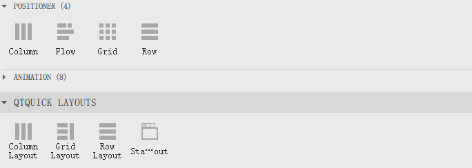
定位器(Row、Column、Grid、Flow)
布局管理器(RowLayout、ColumnLayout、GridLayout、StackLayout)
Layout
要使用layout布局的属性 需要引用
1
| import QtQuick.Layouts 1.15
|
简单示例
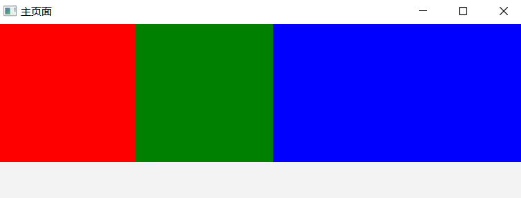
横向分布,最后一个填充剩余空间。
1
2
3
4
5
6
7
8
9
10
11
12
13
14
15
16
17
18
19
20
21
22
23
24
25
26
27
28
29
30
31
32
33
34
35
36
37
38
39
40
| import QtQuick 2.15
import QtQuick.Window 2.15
import QtQuick.Layouts 1.15
Window {
width: 640
height: 480
visible: true
color: "#f3f3f3"
title: qsTr("主页面")
RowLayout {
id: row
height: 200
spacing: 0
anchors.left:parent.left
anchors.right:parent.right
Rectangle {
id: rectangle
width: 200
height: parent.height
color: "red"
}
Rectangle {
id: rectangle2
width: 200
height: parent.height
color: "green"
}
Rectangle {
id: rectangle3
height: parent.height
color: "blue"
Layout.fillWidth: true
}
}
}
|
显示效果
其中
1
2
3
4
5
6
7
| RowLayout {
id: row
height: 200
spacing: 0
anchors.left:parent.left
anchors.right:parent.right
}
|
和
1
2
3
4
5
6
| RowLayout {
id: row
height: 200
width:parent.width
spacing: 0
}
|
是等效的,前者就用了锚(anchors) 布局
只有在Layout相关的控件中才能使用Layout.fillWidth: true相关的属性。
所以RowLayout可以实现元素填充剩余空间,而Row是不可以的,除非我们复制宽度是通过计算的值。
代码如下
1
2
3
4
5
6
7
8
9
10
11
12
13
14
15
16
17
18
19
20
21
22
23
24
25
26
27
28
29
30
31
32
33
34
35
36
37
38
39
| import QtQuick 2.15
import QtQuick.Window 2.15
import QtQuick.Layouts 1.15
Window {
width: 640
height: 480
visible: true
color: "#f3f3f3"
title: qsTr("主页面")
Row {
id: row
height: 200
spacing: 0
anchors.left:parent.left
anchors.right:parent.right
Rectangle {
id: rectangle
width: 200
height: parent.height
color: "red"
}
Rectangle {
id: rectangle2
width: 200
height: parent.height
color: "green"
}
Rectangle {
id: rectangle3
height: parent.height
width: parent.width-rectangle.width-rectangle2.width
color: "blue"
}
}
}
|
属性设置
注意
Layout中不要用anchors来设置了,是无效的。
Margin
1
2
3
4
5
6
7
8
9
| Image {
Layout.leftMargin: 10
Layout.rightMargin: 10
Layout.topMargin: 10
Layout.bottomMargin: 10
Layout.preferredWidth: 20
Layout.preferredHeight: 20
source: "qrc:/imgs/logo01.png"
}
|
或者
1
2
3
4
5
6
| Image {
Layout.margins: 10
Layout.preferredWidth: 20
Layout.preferredHeight: 20
source: "qrc:/imgs/logo01.png"
}
|
宽高
在RowLayout和ColumnLayout中,子组件的宽高就无效了
宽高由Layout.preferredWidth、Layout.preferredHeight、Layout.fillWidth、Layout.fillHeight决定
1
2
3
4
5
6
7
8
9
| Image {
id: m_image
Layout.fillWidth: false
Layout.fillHeight: true
Layout.preferredWidth: 100
Layout.preferredHeight: 100
fillMode:Image.PreserveAspectFit
source: "qrc:/imgs/logo.png"
}
|
对齐
Layout.alignment 属性允许你指定子项在布局中的对齐方式。
你可以使用 Qt.AlignLeft、Qt.AlignRight、Qt.AlignTop、Qt.AlignBottom、Qt.AlignHCenter、Qt.AlignVCenter 等常量来设置对齐方式。
Layout.fillWidth 是一个属性,用于控制子项是否应该扩展以填充其父布局的宽度。
具体来说,当你在使用 GridLayout、RowLayout 或 ColumnLayout 等布局时,可以为子项设置 Layout.fillWidth 属性,以决定子项是否应该水平拉伸以填充可用空间。
Layout.fillWidth: true:这会使子项的宽度扩展以匹配父布局的宽度。也就是说,子项会尽可能地变宽,以填满父布局中分配给它的空间。Layout.fillWidth: false:这是默认值,子项将保持其自然宽度,不会扩展以填充父布局的宽度。
Column和ColumnLayout
在 Qt Quick 中,Column 和 ColumnLayout 都是用来将子项垂直排列的容器类型,但它们在实现方式和使用场景上有一些区别。
对比
Column
- 基本用法:
Column 是一个简单的垂直布局容器,它会按照子项的默认大小将它们垂直排列。
- 子项大小:子项的大小不受
Column 的影响,子项会保持它们的默认大小或设置的显式大小。
- 隐式大小:
Column 的隐式高度是所有子项总高度的和,隐式宽度是所有子项中最大宽度的值。
- 布局调整:
Column 不会自动调整子项的大小,子项的大小由它们自己控制。
ColumnLayout
基本用法:ColumnLayout 是一个更强大的垂直布局容器,它提供了一些布局管理功能,可以自动调整子项的大小。
子项大小:子项可以使用布局属性(如 Layout.preferredHeight 和 Layout.preferredWidth)来指定它们的首选大小。
ColumnLayout 会根据需要调整子项的大小,以适应容器的大小。
隐式大小:ColumnLayout 的隐式高度和宽度取决于子项的布局属性和内容。
布局调整:ColumnLayout 可以自动调整子项的大小,以适应容器的大小,提供了更多的布局灵活性。
简单来说
ColumnLayout等Layout组件和css中的flex类似,子组件会自动适应宽高。
Column等定位组件的子组件则完全取决于自己的属性。
在Row和Column中,子组件的宽高是由自己的宽高决定
1
2
3
4
5
6
| Image {
width: 64
height: 64
fillMode:Image.PreserveAspectFit
source: "qrc:/imgs/logo.png"
}
|
在RowLayout和ColumnLayout中,子组件的宽高就无效了
宽高由Layout.preferredWidth、Layout.preferredHeight、Layout.fillWidth、Layout.fillHeight决定
1
2
3
4
5
6
7
8
9
| Image {
id: m_image
Layout.fillWidth: false
Layout.fillHeight: true
Layout.preferredWidth: 100
Layout.preferredHeight: 100
fillMode:Image.PreserveAspectFit
source: "qrc:/imgs/logo.png"
}
|
示例
Column 示例
1
2
3
4
5
6
7
8
9
10
11
12
13
14
15
16
17
18
19
20
21
| import QtQuick 2.15
import QtQuick.Controls 2.15
Column {
spacing: 10
Rectangle {
width: 100
height: 50
color: "red"
}
Rectangle {
width: 100
height: 70
color: "green"
}
Rectangle {
width: 100
height: 30
color: "blue"
}
}
|
ColumnLayout 示例
1
2
3
4
5
6
7
8
9
10
11
12
13
14
15
16
17
18
19
20
21
| import QtQuick 2.15
import QtQuick.Layouts 1.15
ColumnLayout {
spacing: 10
Rectangle {
Layout.preferredWidth: 100
Layout.preferredHeight: 50
color: "red"
}
Rectangle {
Layout.preferredWidth: 100
Layout.preferredHeight: 70
color: "green"
}
Rectangle {
Layout.preferredWidth: 100
Layout.preferredHeight: 30
color: "blue"
}
}
|
居中示例
Row
1
2
3
4
5
6
7
8
9
10
11
12
13
14
15
16
17
| Row {
Image {
anchors.verticalCenter: parent.verticalCenter
width: 32
height: 32
fillMode:Image.PreserveAspectFit
source: "qrc:/imgs/logo.png"
}
Image {
anchors.verticalCenter: parent.verticalCenter
width: 64
height: 64
fillMode:Image.PreserveAspectFit
source: "qrc:/imgs/logo.png"
}
}
|
RowLayout
1
2
3
4
5
6
7
8
9
10
11
12
13
14
15
16
17
18
| RowLayout {
height:64
Image {
Layout.alignment: Qt.AlignVCenter
Layout.preferredWidth: 32
Layout.preferredHeight: 32
fillMode:Image.PreserveAspectFit
source: "qrc:/imgs/logo.png"
}
Image {
Layout.alignment: Qt.AlignVCenter
Layout.preferredWidth: 64
Layout.preferredHeight: 64
fillMode:Image.PreserveAspectFit
source: "qrc:/imgs/logo.png"
}
}
|
总结
Column 适用于简单的垂直排列场景,子项大小由它们自己控制。ColumnLayout 适用于需要更复杂布局管理的场景,可以自动调整子项的大小。
上下重叠
Item 中的子组件默认不会自动填充整个 Item 的空间,它们的尺寸和位置由自身的属性决定。
如果希望子组件自动填充Item,可以使用以下方法:
- 使用
anchors.fill: parent 让子组件填充整个 Item。
- 直接设置子组件的
width 和 height 为父 Item 的尺寸。
这两种方法都可以让子组件自动填充父 Item 的区域。
1
2
3
4
5
6
7
8
9
10
11
12
13
14
| Item {
width: parent.width
height: parent.height
Image {
id: bg
anchors.fill: parent
source: "qrc:/imgs/bg01.png"
}
ColumnLayout {
anchors.fill: parent
}
}
|
可滚动容器
1
2
3
4
5
6
7
8
9
10
11
12
13
14
15
16
17
18
| ScrollView {
anchors.fill: parent
width: 600
height: 800
contentWidth: 600
clip: true
Rectangle {
width: parent.width
height: 1200
color: "lightgray"
Text {
anchors.centerIn: parent
text: "This is a large content area."
font.pixelSize: 30
}
}
}
|
Item和Rectangle的区别
Item:它是 QML 中所有可视元素的基类,是最基础的可视元素,具备位置、大小、变换等基础属性,但没有默认的外观表现。
也就是说,单纯创建一个Item实例时,在界面上是看不到它的。
Rectangle:继承自Item,这意味着它拥有Item的所有属性,
同时还有自身特有的属性,比如color(填充颜色)、border(边框)、radius(圆角)、clip(内部剪裁)等,默认会以矩形的形状显示在界面上。
比如
1
2
3
4
5
6
7
8
9
| Rectangle {
x: 100
y: 100
width: 100
height: 50
color: "lightblue"
border.color: "black"
border.width: 2
}
|