前言
https://www.antdv.com/components/overview-cn/
主题配置
1
2
3
4
5
6
7
8
9
10
11
| <template>
<a-config-provider
:theme="{
token: {
colorPrimary: '#FA7E31',
},
}"
>
<RouterView/>
</a-config-provider>
</template>
|
中文
1
2
3
4
5
6
7
8
9
10
11
12
13
14
15
16
17
18
19
| <script setup lang="ts">
import { RouterView } from 'vue-router'
import zhCN from 'ant-design-vue/es/locale/zh_CN'
import dayjs from 'dayjs'
import 'dayjs/locale/zh-cn'
dayjs.locale('cn')
</script>
<template>
<a-config-provider
:locale="zhCN"
:theme="{
token: {
colorPrimary: '#FA7E31'
}
}"
>
<RouterView />
</a-config-provider>
</template>
|
其中下面的部分是设置日期选择为中文
否则日期选择弹出框还是英文,设置一次就行。
1
2
3
| import dayjs from 'dayjs'
import 'dayjs/locale/zh-cn'
dayjs.locale('cn')
|
布局类
栅格化
https://www.antdv.com/components/grid-cn
份数
1
2
3
4
5
6
7
| <a-row>
<a-col :span="6" class="z_tb_title">商品信息</a-col>
<a-col :span="4" class="z_tb_title">押金/租金/数量</a-col>
<a-col :span="6" class="z_tb_title">实付款</a-col>
<a-col :span="4" class="z_tb_title">用户地址</a-col>
<a-col :span="4" class="z_tb_title">交易状态</a-col>
</a-row>
|
填充
1
2
3
4
| <a-row>
<a-col flex="100px">100px</a-col>
<a-col flex="auto">auto</a-col>
</a-row>
|
填充2
1
2
3
4
5
6
| <a-row :wrap="false">
<a-col flex="none">
<div style="padding: 0 16px">none</div>
</a-col>
<a-col flex="auto">auto with no-wrap</a-col>
</a-row>
|
间距
水平
1
2
3
4
| <a-space size="middle">
<a-button type="primary">搜索</a-button>
<a-button>重置</a-button>
</a-space>
|
垂直
1
| <a-space direction="vertical"></a-space>
|
水平换行
水平的时候如果想换行的时候不要用a-space,这个有BUG,如果有多行的时候底部会生成一个margin-bottom: -16px;的样式导致样式不对。
1
| <a-space size="middle" :wrap="true" style="width: 100%">
|
可以用a-flex替代:
1
| <a-flex gap="middle" wrap="wrap" style="width: 100%"></a-flex>
|
Flex
水平
1
| <a-flex gap="middle"></a-flex>
|
水平自动换行
1
| <a-flex gap="middle" wrap="wrap"></a-flex>
|
垂直
1
| <a-flex gap="middle" vertical></a-flex>
|
对齐
1
2
| <a-flex vertical align="flex-end" justify="space-between" :style="{ padding: '32px' }">
</a-flex>
|
消息提示
1
2
3
4
5
6
7
8
9
10
11
12
13
| import { message } from 'ant-design-vue';
const info = () => {
message.info('This is a normal message');
};
const success = () => {
message.success('This is a success message');
};
const error = () => {
message.error('This is an error message');
};
const warning = () => {
message.warning('This is a warning message');
};
|
加载中
1
2
3
4
5
| <a-spin tip="加载中..." :spinning="loading">
<div>
页面内容
</div>
</a-spin>
|
TS
1
| const loading = ref<boolean>(false);
|
注意
这个加载中会在抽屉下面
抽屉中建议加载按钮上
1
| <a-button type="primary" :loading="loading">保存</a-button>
|
展示类
文字提示
1
2
3
4
| <a-tooltip>
<template #title> 气泡中的文字 </template>
<div class="z_ellipsis_item"> 文字 </div>
</a-tooltip>
|
让div中的文字超出的显示省略号
1
2
3
4
5
6
7
| .z_ellipsis_item {
width: 100%;
box-sizing: border-box;
overflow: hidden;
text-overflow: ellipsis;
white-space: nowrap;
}
|
图片
https://www.antdv.com/components/image-cn
相比于HTML的img,能够预览图片
1
2
3
4
| <a-image
:width="260"
src="https://zos.alipayobjects.com/rmsportal/jkjgkEfvpUPVyRjUImniVslZfWPnJuuZ.png"
/>
|
走马灯
1
2
| <a-carousel :autoplay="true">
</a-carousel>
|
二维码
https://www.antdv.com/components/qrcode-cn
基本示例
1
| <a-qrcode :value="qrCodeUrl" />
|
默认渲染方式是canvas,会有点糊,可以改为svg,就会很清晰
1
| <a-qrcode :value="qrCodeUrl" type="svg" />
|
调整大小
1
| <a-qrcode :value="qrCodeUrl" type="svg" size="180" />
|
无边框
1
| <a-qrcode :value="qrCodeUrl" type="svg" size="180" :bordered="false" />
|
TS
1
| const qrCodeUrl = ref('https://www.psvmc.cn')
|
拼接URL
1
2
| const { protocol, host } = window.location
qrCodeUrl.value = `${protocol}//${host}/mp.html?id=${item.goodsId}`
|
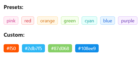
标签
基本
1
2
3
4
5
6
7
8
9
10
11
12
13
14
15
16
17
18
19
| <template>
<h4 style="margin-bottom: 16px">Presets:</h4>
<div>
<a-tag color="pink">pink</a-tag>
<a-tag color="red">red</a-tag>
<a-tag color="orange">orange</a-tag>
<a-tag color="green">green</a-tag>
<a-tag color="cyan">cyan</a-tag>
<a-tag color="blue">blue</a-tag>
<a-tag color="purple">purple</a-tag>
</div>
<h4 style="margin: 16px 0">Custom:</h4>
<div>
<a-tag color="#f50">#f50</a-tag>
<a-tag color="#2db7f5">#2db7f5</a-tag>
<a-tag color="#87d068">#87d068</a-tag>
<a-tag color="#108ee9">#108ee9</a-tag>
</div>
</template>
|
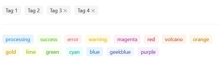
无边框Tag
1
2
3
4
5
6
7
8
9
10
11
12
13
14
15
16
17
18
19
20
21
22
23
24
25
26
| <template>
<a-space :size="[0, 'small']" wrap>
<a-tag :bordered="false">Tag 1</a-tag>
<a-tag :bordered="false">Tag 2</a-tag>
<a-tag :bordered="false" closable>Tag 3</a-tag>
<a-tag :bordered="false" closable>Tag 4</a-tag>
</a-space>
<a-divider />
<a-space :size="[0, 'small']" wrap>
<a-tag :bordered="false" color="processing">processing</a-tag>
<a-tag :bordered="false" color="success">success</a-tag>
<a-tag :bordered="false" color="error">error</a-tag>
<a-tag :bordered="false" color="warning">warning</a-tag>
<a-tag :bordered="false" color="magenta">magenta</a-tag>
<a-tag :bordered="false" color="red">red</a-tag>
<a-tag :bordered="false" color="volcano">volcano</a-tag>
<a-tag :bordered="false" color="orange">orange</a-tag>
<a-tag :bordered="false" color="gold">gold</a-tag>
<a-tag :bordered="false" color="lime">lime</a-tag>
<a-tag :bordered="false" color="green">green</a-tag>
<a-tag :bordered="false" color="cyan">cyan</a-tag>
<a-tag :bordered="false" color="blue">blue</a-tag>
<a-tag :bordered="false" color="geekblue">geekblue</a-tag>
<a-tag :bordered="false" color="purple">purple</a-tag>
</a-space>
</template>
|
标签删除
1
2
3
4
5
6
7
8
| <a-tag
:bordered="false"
closable
v-for="(item, index) in allSelectList"
:key="index"
@close.prevent="closeTag(item, index)"
>{{ item.name }}
</a-tag>
|
进度条
圆形进度条
1
2
3
4
5
6
7
8
9
10
| <a-progress
type="circle"
:stroke-color="{
'0%': '#FFA05C',
'100%': '#FA7E31'
}"
:percent="75"
:size="80"
class="z_margin_t_m"
/>
|
步骤条
1
| <a-steps :current="currStepIndex" :items="stepItems"></a-steps>
|
TS
1
2
3
4
5
6
7
8
9
10
11
12
13
14
15
| const currStepIndex = ref(0)
const stepItems = ref([
{
title: '类目信息'
},
{
title: '商品信息'
},
{
title: '销售信息'
},
{
title: '物流信息'
}
])
|
Card
1
2
| <a-card style="margin: 0.8rem">
</a-card>
|
按钮类
1
2
3
4
5
6
7
8
9
10
| <a-space>
<a-button type="primary">搜索</a-button>
<a-button>重置</a-button>
<a-button type="dashed">虚线按钮</a-button>
<a-button type="text">文本按钮</a-button>
<a-button type="link" danger>删除</a-button>
<a-popconfirm title="确定要删除吗?" ok-text="Yes" cancel-text="No">
<a-button type="link" danger>删除</a-button>
</a-popconfirm>
</a-space>
|
确认
1
2
3
4
5
6
7
8
9
10
| <a-popconfirm
title="确定要删除吗?"
ok-text="是"
cancel-text="否"
@confirm="delItemClick(sort_item)"
>
<a-button type="link" danger size="small">
<comp-iconfont icon-name="icon-shanchu" />
</a-button>
</a-popconfirm>
|
气泡卡片
1
2
3
4
5
6
7
8
9
10
11
12
13
| <a-popover placement="bottomRight">
<template #title></template>
<template #content>
<a-space direction="vertical" :size="0">
<a-button type="text">用户信息</a-button>
<a-button type="text">退出登录</a-button>
</a-space>
</template>
<div>
管理员
</div>
</a-popover>
|
也可以使用
1
2
3
4
5
6
7
8
9
10
11
12
13
14
15
| <a-dropdown>
<div>
管理员
</div>
<template #overlay>
<a-menu>
<a-menu-item>
<a href="javascript:;">用户信息</a>
</a-menu-item>
<a-menu-item>
<a href="javascript:;">退出登录</a>
</a-menu-item>
</a-menu>
</template>
</a-dropdown>
|
注意
在a-popover中使用a-menu,右侧会多一个竖线。
但是在a-dropdown中使用a-menu就没有。
弹窗类
抽屉
基本
1
2
3
4
5
6
7
8
9
| <a-drawer
width="60%"
title="添加"
placement="right"
:open="showAddDrawer"
@close="onAddDrawerClose"
>
<p>页面内容</p>
</a-drawer>
|
TS
1
2
3
4
| const showAddDrawer = ref(false)
const onAddDrawerClose = () => {
showAddDrawer.value = false
}
|
顶部按钮
1
2
3
4
5
6
7
8
9
10
11
12
13
| <a-drawer
:width="500"
title="添加"
placement="right"
:open="showAddDrawer"
@close="onAddDrawerClose"
>
<template #extra>
<a-button style="margin-right: 8px" @click="onAddDrawerClose">取消</a-button>
<a-button type="primary" @click="onAddDrawerClose">添加</a-button>
</template>
<p>页面内容</p>
</a-drawer>
|
TS
1
2
3
4
| const showAddDrawer = ref(false)
const onAddDrawerClose = () => {
showAddDrawer.value = false
}
|
项目示例
1
2
3
4
5
6
7
8
9
10
11
12
13
| <a-drawer
width="60%"
title="订单分配"
placement="right"
:open="showXxDrawer"
@close="onXxDrawerClose"
>
<comp-order-assign
:order-id="formState.orderId"
v-if="showXxDrawer"
@drawer-close="showXxCloseAction"
/>
</a-drawer>
|
TS
1
2
3
4
5
6
7
8
9
10
11
12
13
14
15
16
|
const showXxDrawer = ref(false)
function showXxClick(item: TOrder) {
formState.orderId = item.orderId
showXxDrawer.value = true
}
const onXxDrawerClose = () => {
showXxDrawer.value = false
}
function showXxCloseAction() {
showXxDrawer.value = false
actionList()
}
|
组件内
1
2
3
4
5
6
7
8
9
10
11
| const props = defineProps({
orderId: { type: Number, required: true }
})
const emit = defineEmits<{
(e: 'drawerClose'): void
}>()
emit('drawerClose')
|
弹窗/对话框
https://www.antdv.com/components/modal-cn
弹窗和抽屉后出现的在上层
1
2
3
4
5
6
7
8
9
10
| <a-modal
v-model:open="showConfirmModal"
title="修改单号"
ok-text="确认"
cancel-text="取消"
width="800px"
@ok="modalOkClick"
>
<div>弹窗内容</div>
</a-modal>
|
TS
1
2
3
4
5
6
7
8
| const showConfirmModal = ref(false)
function editFormCodeClick() {
showConfirmModal.value = true
resetModalAttr()
}
function modalOkClick() {
showConfirmModal.value = false
}
|
注意,最新Vue版本4.2.5依旧会出现下面的报错,这个在React的版本已经解决了,但是Vue版本依旧有这个问题
Blocked aria-hidden on an element because its descendant retained focus.
解决方法
在a-modal打开后调用resetModalAttr。
1
2
3
4
5
6
7
8
9
10
11
12
13
| async function resetModalAttr(){
await nextTick();
const domArr = document.getElementsByClassName('ant-modal')
if (domArr && domArr.length > 0) {
Array.from(domArr)
.forEach(item => {
const elements = item.querySelectorAll('[aria-hidden]');
elements.forEach(element => {
element.setAttribute('aria-hidden', 'false')
});
})
}
}
|
树组件
1
2
3
4
5
6
7
8
9
10
11
12
13
14
15
16
17
18
19
20
21
22
23
24
25
26
27
28
29
30
31
32
33
34
35
36
37
38
39
40
41
42
43
44
45
46
47
48
49
50
51
52
53
54
55
56
57
58
59
60
61
62
63
64
65
66
67
| <template>
<div class="SelectTypeSingleView">
<a-card>
<a-flex vertical gap="small">
<a-flex gap="small" wrap="wrap">
已选择商品:
<a-tag :bordered="false" color="orange" v-if="model" closable @close.prevent="closeTag()">
{{ model.sortName }}
</a-tag>
</a-flex>
<a-tree
:default-expand-all="true"
:blockNode="false"
v-if="treeData"
v-model:selectedKeys="selectedKeys"
:height="600"
:fieldNames="{ children: 'childList', title: 'sortName', key: 'sortId' }"
:tree-data="treeData"
@select="onSelect"
>
</a-tree>
</a-flex>
</a-card>
</div>
</template>
<script lang="ts" setup>
import { onMounted, ref, watch } from 'vue'
import { message, type TreeProps, type TreeSelectProps } from 'ant-design-vue'
import { apiSortListSel } from '@/assets/api/common_api'
const model = defineModel<TSort | null>()
const selectedKeys = ref<number[]>([])
watch(model, () => {
if (model.value) {
selectedKeys.value = [model.value.sortId]
}
})
const onSelect: TreeProps['onSelect'] = (selectedKeys, info) => {
if (selectedKeys.length > 0) {
let { sortName, sortId, sortImg, rversion, sortPid } = info.node
model.value = { sortName, sortId, sortImg, rversion, sortPid }
} else {
model.value = null
}
}
const treeData = ref<TreeSelectProps['treeData']>()
async function getTreeData() {
let result = await apiSortListSel()
if (result.code == 0) {
treeData.value = result.obj
} else {
message.warning(result.msg)
}
}
function closeTag() {
model.value = null
selectedKeys.value.length = 0
}
onMounted(() => {
getTreeData()
})
</script>
<style src="./SelectTypeSingleView.less" lang="less" scoped></style>
|
下拉树菜单
https://www.antdv.com/components/tree-select-cn
基本
1
2
3
4
5
6
7
8
9
10
11
12
| <a-tree-select
v-model:value="value"
show-search
style="width: 300px"
:dropdown-style="{ maxHeight: '400px', overflow: 'auto' }"
placeholder="请选择"
allow-clear
tree-default-expand-all
:tree-data="treeData"
tree-node-filter-prop="label"
>
</a-tree-select>
|
TS
1
2
3
4
5
6
7
8
9
10
11
12
13
14
15
16
17
18
19
20
21
22
23
24
| import type { TreeSelectProps } from 'ant-design-vue'
const value = ref<string>()
const treeData = ref<TreeSelectProps['treeData']>([
{
label: '分类1',
value: '分类1',
children: [
{
label: '子分类1',
value: '子分类1',
children: []
},
{
label: '子分类2',
value: '子分类2'
}
]
},
{
label: '分类2',
value: '分类2',
children: []
}
])
|
自定义属性
1
2
3
4
5
6
7
8
9
10
11
12
13
| <a-tree-select
v-model:value="value"
show-search
style="width: 100%"
:dropdown-style="{ maxHeight: '400px', overflow: 'auto' }"
placeholder="请选择"
allow-clear
tree-default-expand-all
:fieldNames="{ children: 'nodeSonList', label: 'nodeName', value: 'nodeValue' }"
:tree-data="treeData"
tree-node-filter-prop="nodeName"
>
</a-tree-select>
|
TS
1
2
3
4
5
6
7
8
9
10
11
12
13
14
15
16
17
18
19
20
21
22
23
24
| import type { TreeSelectProps } from 'ant-design-vue'
const value = ref<string>()
const treeData = ref<TreeSelectProps['treeData']>([
{
nodeName: '分类1',
nodeValue: '分类1',
nodeSonList: [
{
nodeName: '子分类1',
nodeValue: '子分类1',
nodeSonList: []
},
{
nodeName: '子分类2',
nodeValue: '子分类2'
}
]
},
{
nodeName: '分类2',
nodeValue: '分类2',
nodeSonList: []
}
])
|
禁止节点选择
对应的节点添加disabled: true即可。
1
2
3
4
5
6
7
8
9
10
11
12
13
14
15
16
17
18
19
20
21
22
23
| const treeData = ref<TreeSelectProps['treeData']>([
{
label: '分类1',
value: '分类1',
disabled: true,
children: [
{
label: '子分类1',
value: '子分类1',
children: []
},
{
label: '子分类2',
value: '子分类2'
}
]
},
{
label: '分类2',
value: '分类2',
children: []
}
])
|
下拉菜单
基本
1
2
3
4
| <a-select v-model:value="formState.couponType" style="width: 120px">
<a-select-option :value="1">抵扣券</a-select-option>
<a-select-option :value="2">折扣券</a-select-option>
</a-select>
|
多选
1
2
3
4
5
6
7
| <a-select
v-model:value="tagValues"
:options="options"
mode="multiple"
placeholder="选择标签"
>
</a-select>
|
TS
1
2
| const tagValues = ref<string[]>([])
let options = [{value:"香蕉"},{value:"苹果"},{value:"菠萝"}]
|
或者
1
2
3
4
| <a-select v-model:value="formState.couponType" mode="multiple" style="width: 120px">
<a-select-option :value="1">抵扣券</a-select-option>
<a-select-option :value="2">折扣券</a-select-option>
</a-select>
|
Tab
1
2
3
4
5
| <a-tabs v-model:activeKey="activeKey">
<a-tab-pane key="1" tab="全部"></a-tab-pane>
<a-tab-pane key="2" tab="上架中"></a-tab-pane>
<a-tab-pane key="3" tab="审核中"></a-tab-pane>
</a-tabs>
|
TS
1
| const activeKey = ref('1');
|
https://www.antdv.com/components/form-cn
基本示例
1
2
3
4
5
6
7
8
9
10
11
12
13
14
15
16
17
18
19
20
21
22
23
24
25
26
27
28
29
| <a-form
:model="formState"
name="basic"
:label-col="{ span: 4 }"
:wrapper-col="{ span: 20 }"
autocomplete="off"
@finish="onFinish"
@finishFailed="onFinishFailed"
>
<a-form-item
label="热词"
name="hotWord"
:rules="[{ required: true, message: '不能为空!' }]"
>
<a-input v-model:value="formState.hotWord" />
</a-form-item>
<a-form-item
label="热度"
name="hotNum"
:rules="[{ required: true, message: '不能为空!' }]"
>
<a-input-number v-model:value="formState.hotNum" style="width: 100%" />
</a-form-item>
<a-form-item :wrapper-col="{ offset: 10, span: 14 }">
<a-button type="primary" html-type="submit">添加</a-button>
</a-form-item>
</a-form>
|
TS
1
2
3
4
5
6
7
8
9
10
11
12
13
14
15
16
| interface FormState {
hotWord: string
hotNum: number
}
const formState = reactive<FormState>({
hotWord: '',
hotNum: 0
})
const onFinish = (values: any) => {
console.log('Success:', values)
}
const onFinishFailed = (errorInfo: any) => {
console.log('Failed:', errorInfo)
}
|
JS提交
1
2
3
4
5
6
7
8
9
10
11
12
13
| <a-form ref="formRef"
:label-col="{ span: 24 }"
:wrapper-col="{ span: 24 }"
autocomplete="off"
:model="formState">
<a-form-item
label="快递单号"
name="code"
:rules="[{ required: true, message: '不能为空!' }]"
>
<a-input v-model:value="formState.code" />
</a-form-item>
</a-form>
|
TS
1
2
3
4
5
6
7
8
9
10
11
12
13
14
15
| import type { FormInstance } from 'ant-design-vue'
const formRef = ref<FormInstance>()
const formState = reactive<any>({
code: '',
})
formRef.value
?.validate()
.then(
(result) => {
console.info('result', result)
})
.catch(
(err) => {
console.info('err', err)
})
|
如果校验通过会进入then回调,返回的数据是表单中所有属性的对象,不是表单绑定的对象,只有内部有的属性才会返回。
1
| {"bannerImg":"https://www.psvmc.cn/head.jpg","sortType":1}
|
校验失败则会进入catch。
1
2
3
4
5
| {
"values":{"bannerImg":"","sortType":1},
"errorFields":[{"name":["bannerImg"],"errors":["不能为空!"],"warnings":[]}],
"outOfDate":false
}
|
标题和输入上下分布
1
2
3
4
5
6
7
8
9
| <a-form
:model="formState"
name="basic"
:label-col="{ span: 24 }"
:wrapper-col="{ span: 10 }"
autocomplete="off"
@finish="onFinish"
>
</a-form>
|
就是设置label-col占一行即可。
单行输入
1
2
3
| <a-form-item label="优惠券名称" name="hotWord" :rules="[{ required: true, message: '不能为空!' }]">
<a-input v-model:value="formState.hotWord" />
</a-form-item>
|
清空按钮
1
| <a-input v-model:value="filterObj.title" placeholder="请输入标题关键字" allowClear />
|
数字输入
1
2
3
| <a-form-item label="热度" name="hotNum" :rules="[{ required: true, message: '不能为空!' }]">
<a-input-number v-model:value="formState.hotNum" style="width: 100%" />
</a-form-item>
|
设置最大最小
1
2
3
4
5
6
| <a-input-number
:min="0"
:max="100"
v-model:value="formState.settlementRatio"
style="width: 160px"
/>
|
多行输入
1
2
3
| <a-form-item label="规则说明" name="couponType" :rules="[{ required: true, message: '不能为空!' }]">
<a-textarea v-model:value="formState.hotWord" placeholder="请输入使用规则" />
</a-form-item>
|
设置行数
1
| <a-textarea :autoSize="{ minRows: 4, maxRows: 6 }" v-model:value="formState.summary" />
|
下拉菜单
1
2
3
4
5
6
| <a-form-item label="优惠券类型" name="couponType" :rules="[{ required: true, message: '不能为空!' }]">
<a-select v-model:value="formState.couponType">
<a-select-option :value="1">抵扣券</a-select-option>
<a-select-option :value="2">折扣券</a-select-option>
</a-select>
</a-form-item>
|
开关
1
| <a-switch v-model:checked="checked" />
|
设置选中时的值
1
2
3
4
5
6
| <a-switch
v-model:checked="formState.isWhite"
:checkedValue="1"
:unCheckedValue="0"
@change="goodsWhiteChange(record)"
/>
|
单选按钮
1
2
3
4
5
6
| <a-form-item label="优惠券类型" name="couponType" :rules="[{ required: true, message: '不能为空!' }]">
<a-radio-group v-model:value="formState.couponType">
<a-radio :value="1">平台</a-radio>
<a-radio :value="2">商家</a-radio>
</a-radio-group>
</a-form-item>
|
样式2
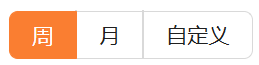
1
2
3
4
5
| <a-radio-group v-model:value="dateType" button-style="solid">
<a-radio-button :value="1">周</a-radio-button>
<a-radio-button :value="2">月</a-radio-button>
<a-radio-button :value="3">自定义</a-radio-button>
</a-radio-group>
|
TS
多选
基本
1
| <a-checkbox v-model:checked="checked">Checkbox</a-checkbox>
|
多选按钮组
1
| <a-checkbox-group v-model:value="cbValue" name="checkboxgroup" :options="cbItemList" />
|
TS
1
2
3
4
5
6
| const cbValue = reactive([1])
const cbItemList = [
{ label: '90天质保', value: 1 },
{ label: '质量保修', value: 2 },
{ label: '按时发货', value: 3 }
]
|
一行多个
1
2
3
4
5
6
7
8
9
10
11
12
| <a-form-item label="使用条件" name="couponType" :rules="[{ required: true, message: '不能为空!' }]">
<a-space>
<a-select v-model:value="formState.couponType" style="width: 120px">
<a-select-option :value="1">签约价值</a-select-option>
<a-select-option :value="2">总租金</a-select-option>
<a-select-option :value="3">月租金</a-select-option>
</a-select>
满
<a-input v-model:value="formState.hotWord" />
元可使用
</a-space>
</a-form-item>
|
可输入可选择
和下拉菜单的区别是它可以输入也可以单选
1
2
3
4
5
6
| <a-auto-complete
v-model:value="formState.groupName"
:options="options"
placeholder="选择分组"
>
</a-auto-complete>
|
报错
You can set not need to be collected fields into a-form-item-rest
原因是一个表单项下出现了多个输入项
第一种,使用多个 a-form-item:
1
2
3
4
5
6
| <a-form-item>
<a-input name="a"></a-input>
<a-form-item>
<a-input name="b"></a-input>
</a-form-item>
</a-form-item>
|
第二种,使用 a-form-item-rest 组件:
它会阻止数据的收集,你可以将不需要收集校验的表单项放到这个组件中即可,它和第一种方式很类似,但它不会产生额外的 dom 节点。
1
2
3
4
5
6
| <a-form-item>
<a-input name="a"></a-input>
<a-form-item-rest>
<a-input name="b"></a-input>
</a-form-item-rest>
</a-form-item>
|
日期选择
https://www.antdv.com/components/date-picker-cn
单个日期
1
2
3
4
5
6
7
8
9
10
11
12
13
14
15
16
17
18
| <template>
<a-space direction="vertical" :size="12">
<a-date-picker v-model:value="value1" />
<a-date-picker v-model:value="value2" picker="week" />
<a-date-picker v-model:value="value3" picker="month" />
<a-date-picker v-model:value="value4" picker="quarter" />
<a-date-picker v-model:value="value5" picker="year" />
</a-space>
</template>
<script lang="ts" setup>
import { ref } from 'vue';
import type { Dayjs } from 'dayjs';
const value1 = ref<Dayjs>();
const value2 = ref<Dayjs>();
const value3 = ref<Dayjs>();
const value4 = ref<Dayjs>();
const value5 = ref<Dayjs>();
</script>
|
注意绑定的日期类型不是字符串
1
2
3
4
5
6
7
8
9
10
| import type { Dayjs } from 'dayjs'
const beginDateObj = ref<Dayjs>()
watch(beginDateObj, () => {
if (beginDateObj.value) {
filterObj.begindate = beginDateObj.value.format('YYYY-MM-DD')
} else {
filterObj.begindate = ''
}
})
|
禁止选择
1
2
3
4
5
| <a-date-picker
v-model:value="endDateObj"
:disabled-date="disabledDate"
placeholder="结束日期"
/>
|
TS
1
2
3
4
5
6
7
8
9
10
11
12
13
14
15
16
17
18
19
| const endDateObj = ref<Dayjs>()
const props = defineProps({
realEnd: { type: String, required: true }
})
watch(endDateObj, () => {
if (endDateObj.value) {
formState.endTime = endDateObj.value.format('YYYY-MM-DD')
} else {
formState.endTime = ''
}
})
endDateObj.value = dayjs(props.realEnd).startOf('day').add(30, 'day')
const disabledDate = (current: Dayjs) => {
return current && current < dayjs(props.realEnd).endOf('day')
}
|
这里是时间选择必须在props.realEnd之后。
日期和时间
示例1
1
| <a-date-picker show-time placeholder="选择日期时间" v-model:value="beginDateObj"/>
|
TS
1
2
3
4
5
6
7
8
| const beginDateObj = ref<Dayjs>()
watch(beginDateObj, () => {
if (beginDateObj.value) {
formState.useTimeBegin = beginDateObj.value.format('YYYY-MM-DD HH:mm:ss')
} else {
formState.useTimeBegin = ''
}
})
|
示例2
1
| <a-date-picker show-time placeholder="选择日期时间" format="YYYY-MM-DD HH:mm:ss" @change="onChange" @ok="onOk" />
|
日期也可以控制不选秒
1
| <a-date-picker show-time placeholder="选择日期时间" format="YYYY-MM-DD HH:mm" @change="onChange" @ok="onOk" />
|
TS
1
2
3
4
5
6
7
| const onChange = (value: Dayjs, dateString: string) => {
console.log('Selected Time: ', value);
console.log('Formatted Selected Time: ', dateString);
};
const onOk = (value: Dayjs) => {
console.log('onOk: ', value);
};
|
日期段
单个组件
1
2
3
4
| <a-space align="center">
创建时间:
<a-range-picker v-model:value="dateRange" />
</a-space>
|
TS
1
2
3
4
5
6
7
8
9
10
11
12
13
14
15
16
17
18
19
20
21
| import type { Dayjs } from 'dayjs'
type RangeValue = [Dayjs, Dayjs]
const dateRange = ref<RangeValue>()
watch(dateRange, () => {
if (dateRange.value) {
if (dateRange.value[0]) {
filterObj.begindate = dateRange.value[0].format('YYYY-MM-DD')
} else {
filterObj.begindate = ''
}
if (dateRange.value[1]) {
filterObj.enddate = dateRange.value[1].format('YYYY-MM-DD')
} else {
filterObj.enddate = ''
}
} else {
filterObj.begindate = ''
filterObj.enddate = ''
}
})
|
重置的时候
1
2
3
| dateRange.value = undefined
filterObj.begindate = ''
filterObj.enddate = ''
|
限制时间范围
1
| <a-range-picker v-model:value="dateRange" show-time />
|
JS
1
2
3
4
5
6
7
8
9
10
11
12
13
14
15
16
17
18
19
20
21
22
23
24
25
26
27
28
29
30
| type RangeValue = [Dayjs, Dayjs]
const dateRange = ref<RangeValue>()
watch(dateRange, async () => {
if (dateRange.value) {
if (dateRange.value[0]) {
formState.publishStartTime = dateRange.value[0].format('YYYY-MM-DD HH:mm:ss')
} else {
formState.publishStartTime = ''
}
if (dateRange.value[1]) {
formState.publishEndTime = dateRange.value[1].format('YYYY-MM-DD HH:mm:ss')
} else {
formState.publishEndTime = ''
}
await nextTick()
if (dateRange.value[0] && dateRange.value[1]) {
const diffDays = dateRange.value[1].diff(dateRange.value[0], 'day')
if (diffDays > 180) {
message.warning('有效期必须在180天以内')
dateRange.value = undefined
formState.publishStartTime = ''
formState.publishStartTime = ''
}
}
} else {
formState.publishStartTime = ''
formState.publishEndTime = ''
}
})
|
多个组件
1
2
3
4
5
6
7
8
9
| <a-space align="center">
<span>开始日期:</span>
<a-date-picker v-model:value="beginDateObj" placeholder="开始日期" />
</a-space>
<a-space align="center">
<span>结束日期:</span>
<a-date-picker v-model:value="endDateObj" placeholder="结束日期" />
</a-space>
|
TS
1
2
3
4
5
6
7
8
9
10
11
12
13
14
15
16
17
18
19
| import type { Dayjs } from 'dayjs'
const beginDateObj = ref<Dayjs>()
watch(beginDateObj, () => {
if (beginDateObj.value) {
filterObj.begindate = beginDateObj.value.format('YYYY-MM-DD')
} else {
filterObj.begindate = ''
}
})
const endDateObj = ref<Dayjs>()
watch(endDateObj, () => {
if (endDateObj.value) {
filterObj.enddate = endDateObj.value.format('YYYY-MM-DD')
} else {
filterObj.enddate = ''
}
})
|