按钮 文字按钮 添加ZButton.qml
1
2
3
4
5
6
7
8
9
10
11
12
13
14
15
16
17
18
19
20
21
22
23
24
25
26
27
28
29
30
31
32
33
34
35
36
37
38
39
40
41
42
43
44
45
46
47
48
49
50
51
52
53
54
55
import QtQuick 2.15 import QtQuick.Window 2.15 /* 文件名即自定义控件名 使用别名导出属性:相当于函数的变量形参 不同的是导出的属性,调用控件是可以不使用(赋值) */ Rectangle { id : root //导出自定义属性 property alias text: label.text property alias fontSize: label.font.pointSize property alias textColor: label.color property alias bgColor: root.color property alias borderRadius: root.radius property alias borderColor: root.border.color property alias borderWidth: root.border.width signal clicked width: 116 height: 36 color: "#2ccb92" border.color: "#f3f3f3" border.width: 0 radius: 4 Text { id : label anchors.centerIn: parent text: "按钮" font.family: "微软雅黑" font.pointSize: parent.height / 3 color: "white" } MouseArea { anchors.fill: parent hoverEnabled: true cursorShape: "PointingHandCursor" onEntered: { root.opacity = 0.8 } onExited: { root.opacity = 1 } onClicked: { root.clicked() } } }
注意
在自定义导出属性的时候不要和最外层的组件的属性名重复,会覆盖掉默认的属性。
使用
1
2
3
4
5
6
7
8
9
10
11
12
13
14
15
16
17
18
import QtQuick 2.15 import QtQuick.Window 2.15 Window { width: 640 height: 240 visible: true title: qsTr("Hello World" ) ZButton{ text: "我是按钮" height: 36 width: 100 fontSize: 12 borderRadius: 18 anchors.horizontalCenter: parent.horizontalCenter anchors.topMargin: 10 } }
如果我们的文件在components文件夹中 我们可以这样引用
1
2
import "components" as ComponentsComponents.ZButton {}
图片按钮 ZButtonImg.qml
1
2
3
4
5
6
7
8
9
10
11
12
13
14
15
16
17
18
19
20
21
22
23
24
25
26
27
28
29
30
31
32
33
34
35
36
37
38
39
40
41
42
43
44
45
46
import QtQuick 2.15 import QtQuick.Window 2.15 Rectangle { id: root property alias img: img.source property alias bgColor: root.color property alias borderRadius: root.radius property alias borderColor: root.border.color property alias borderWidth: root.border.width signal clicked width: 36 height: 36 color: "transparent" border.color: "#f3f3f3" border.width: 0 radius: 4 Image { id: img width: 20 height: 20 anchors.centerIn: parent } MouseArea { anchors.fill: parent hoverEnabled: true cursorShape: "PointingHandCursor" onEntered: { root.opacity = 0.8 } onExited: { root.opacity = 1 } onClicked: { root.clicked() } } }
使用
1
2
3
4
5
6
7
import "components" as ComponentsComponents.ZButtonImg { img: "qrc:/imgs/close.png" onClicked: { console.info("点击" ) } }
下拉菜单 添加ZComboBox.qml
1
2
3
4
5
6
7
8
9
10
11
12
13
14
15
16
17
18
19
20
21
22
23
24
25
26
27
28
29
30
31
32
33
34
35
36
37
38
39
40
41
42
43
44
45
46
47
48
49
50
51
52
53
54
55
56
57
58
59
60
61
62
63
64
65
66
67
68
69
70
71
72
73
74
75
76
77
78
79
80
81
82
83
84
85
86
87
88
89
90
91
92
93
94
95
96
97
98
99
100
101
102
103
104
105
106
107
108
109
110
111
112
113
114
115
116
117
118
119
120
121
122
123
124
125
126
127
128
129
130
131
132
133
134
135
136
137
138
139
140
141
142
143
144
145
146
147
148
149
150
151
152
153
154
155
156
157
158
159
160
161
162
163
164
165
166
167
168
169
170
171
172
173
174
175
176
177
178
179
180
181
182
183
184
185
186
187
188
189
190
191
import QtQuick 2.15 import QtQuick.Window 2.15 import QtQuick.Templates 2.15 as Timport QtQuick.Controls 2.15 import QtQuick.Controls.impl 2.15 T.ComboBox { id :control //checked选中状态,down按下状态,hovered悬停状态 property color backgroundTheme: "#fefefe" //下拉框背景色 property color backgroundColor: control.down ? "#eeeeee" : control.hovered ? Qt.lighter(backgroundTheme) : backgroundTheme //边框颜色 property color borderColor: Qt.darker(backgroundTheme) //item高亮颜色 property color itemHighlightColor: "#eeeeee" //item普通颜色 property color itemNormalColor: backgroundTheme //每个item的高度 property int itemHeight: height //每个item文本的左右padding property int itemPadding: 10 //下拉按钮左右距离 property int indicatorPadding: 3 //下拉按钮图标 property url indicatorSource: "qrc:/qt-project.org/imports/QtQuick/Controls.2/images/double-arrow.png" //圆角 property int radius: 4 //最多显示的item个数 property int showCount: 5 //文字颜色 property color textColor: "#333333" property color textSelectedColor: "#222222" //model数据左侧附加的文字 property string textLeft: "" //model数据右侧附加的文字 property string textRight: "" implicitWidth: 120 implicitHeight: 30 spacing: 0 leftPadding: padding rightPadding: padding + indicator.width + spacing font{ family: "微软雅黑" pixelSize: 16 } //各item delegate: ItemDelegate { id : box_item height: control.itemHeight //Popup如果有padding,这里要减掉2 *pop.padding width: control.width padding: 0 contentItem: Text { text: control.textLeft+ (control.textRole ? (Array.isArray(control.model) ? modelData[control.textRole] : model[control.textRole]) : modelData)+ control.textRight color: (control.highlightedIndex == index) ? control.textSelectedColor : control.textColor leftPadding: control.itemPadding rightPadding: control.itemPadding font: control.font elide: Text.ElideRight renderType: Text.NativeRendering verticalAlignment: Text.AlignVCenter } hoverEnabled: control.hoverEnabled background: Rectangle{ radius: control.radius color: (control.highlightedIndex == index) ? control.itemHighlightColor : control.itemNormalColor //item底部的线 Rectangle{ height: 1 width: parent.width-2 *control.radius anchors.bottom: parent.bottom anchors.horizontalCenter: parent.horizontalCenter color: Qt.lighter(control.itemNormalColor) } } } indicator: Item{ id : box_indicator x: control.width - width y: control.topPadding + (control.availableHeight - height) / 2 width: box_indicator_img.width+control.indicatorPadding*2 height: control.height //按钮图标 Image { id : box_indicator_img anchors.centerIn: parent source: control.indicatorSource } } //box显示item contentItem: T.TextField{ //control的leftPadding会挤过来,不要设置control的padding leftPadding: control.itemPadding rightPadding: control.itemPadding text: control.editable ? control.editText : (control.textLeft+control.displayText+control.textRight) font: control.font color: control.textColor verticalAlignment: Text.AlignVCenter //默认鼠标选取文本设置为false selectByMouse: true //选中文本的颜色 selectedTextColor: "green" //选中文本背景色 selectionColor: "white" clip: true //renderType: Text.NativeRendering enabled: control.editable autoScroll: control.editable readOnly: control.down inputMethodHints: control.inputMethodHints validator: control.validator renderType: Text.NativeRendering background: Rectangle { visible: control.enabled && control.editable border.width: parent && parent.activeFocus ? 1 : 0 border.color: control.itemHighlightColor color: "transparent" } } //box框背景 background: Rectangle { implicitWidth: control.implicitWidth implicitHeight: control.implicitHeight radius: control.radius color: control.backgroundColor border.color: control.borderColor } //弹出框 popup: T.Popup { //默认向下弹出,如果距离不够,y会自动调整() y: control.height width: control.width //根据showCount来设置最多显示item个数 implicitHeight: control.delegateModel ?((control.delegateModel.count<showCount) ?contentItem.implicitHeight :control.showCount*control.itemHeight)+2 :0 //用于边框留的padding padding: 1 contentItem: ListView { clip: true implicitHeight: contentHeight model: control.popup.visible ? control.delegateModel : null currentIndex: control.highlightedIndex //按行滚动SnapToItem ;像素移动SnapPosition snapMode: ListView.SnapToItem //ScrollBar.horizontal: ScrollBar { visible: false } ScrollBar.vertical: ScrollBar { //定制滚动条 id : box_bar implicitWidth: 10 visible: control.delegateModel&&(control.delegateModel.count>showCount) //background: Rectangle{} //这是整体的背景 contentItem: Rectangle{ implicitWidth:10 radius: width/2 color: box_bar.pressed ? Qt.rgba(0.6 ,0.6 ,0.6 ) : Qt.rgba(0.6 ,0.6 ,0.6 ,0.5 ) } } } //弹出框背景(只有border显示出来了,其余部分被delegate背景遮挡) background: Rectangle{ border.width: 1 border.color: control.borderColor radius: control.radius } } }
使用方式
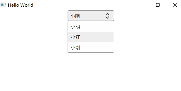
1
2
3
4
5
6
7
8
9
10
11
12
13
14
15
16
17
18
import QtQuick 2.15 import QtQuick.Window 2.15 Window { width: 640 height: 280 visible: true title: qsTr("Hello World" ) ZComboBox{ width: 160 height: 36 model: ["小明" ,"小红" ,"小刚" ] editable: false anchors.horizontalCenter: parent.horizontalCenter anchors.topMargin: 10 } }
效果