前言 本文本来是在WPF桌面端开发1中写过的,但是随着篇幅越来越长,就单独拆出来了。
静态容器
Canvas布局 绝对定位
StackPanel 行列布局不能换行
WrapPanel 行列布局能换行
DockPanel 东西南北布局
Grid 网格布局 最强大的布局
UniformGrid 简化网格布局 等分布局
Canvas布局 Canvas是一个类似于坐标系的面板,所有的元素通过设置坐标来决定其在坐标系中的位置。具体表现为使用Left、Top、Right、 Bottom附加属性在Canvas中定位控件。
相同位置的元素后面的居上
1 2 3 4 5 6 <Canvas > <Button Canvas.Left ="50" Canvas.Top ="50" Content ="Button 1" > </Button > <Button Canvas.Right ="50" Canvas.Top ="50" Content ="Button 2" > </Button > <Button Canvas.Left ="50" Canvas.Bottom ="50" Content ="Button 3" > </Button > <Button Canvas.Right ="50" Canvas.Bottom ="50" Content ="Button 4" > </Button > </Canvas >
StackPanel布局 StackPanel将控件按照行或列来顺序排列,但不会换行。通过设置面板的Orientation属性设置了两种排列方式:横排(Horizontal默认的)和竖排(Vertical),默认为竖排(Vertical)。
1 2 3 4 5 <StackPanel Name ="stackpanel3" Orientation ="Horizontal" FlowDirection ="RightToLeft" > <Button Content ="Button7" > </Button > <Button Content ="Button8" > </Button > <Button Content ="Button9" > </Button > </StackPanel >
WrapPanel布局 WrapPanel布局面板将各个控件按照一定方向罗列,当长度或高度不够时自动调整进行换行换列。
Orientation=”Horizontal”时各控件从左至右罗列,当面板长度不够时,子控件就会自动换行,继续按照从左至右的顺序排列。
Orientation=”Vertical”时各控件从上至下罗列,当面板高度不够时,子控件就会自动换列,继续按照从上至下的顺序排列。
1 2 3 4 5 6 7 8 9 <WrapPanel Orientation ="Horizontal" > <Button Content ="Button 150" Width ="150" > </Button > <Button Content ="Button 200" Width ="200" > </Button > <Button Content ="Button 150" Width ="150" > </Button > <Button Content ="Button 200" Width ="200" > </Button > <Button Content ="Button 150" Width ="150" > </Button > <Button Content ="Button 200" Width ="200" > </Button > <Button Content ="Button 150" Width ="150" > </Button > </WrapPanel >
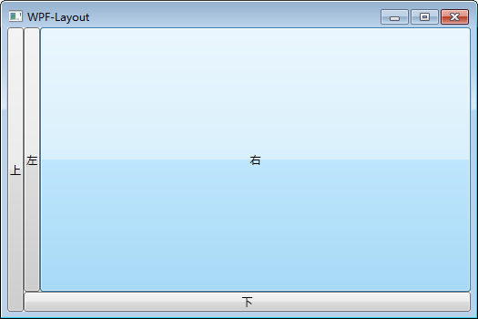
DockPanel布局 DockPanel支持让元素简单地停靠在整个面板的某一条边上,然后拉伸元素以填满全部宽度或高度。它也支持让一个元素填充其他已停靠元素没有占用的剩余空间。
DockPanel有一个Dock附加属性,因此子元素用4个值来控制她们的停靠:Left、Top、Right、Bottom。Dock没有Fill值。作为替代,最后的子元素将加入一个DockPanel并填满所有剩余的空间,除非DockPanel的LastChildFill属性为false,它将朝某个方向停靠。
1 2 3 4 5 6 <DockPanel > <Button Content ="上" DockPanel.Dock ="Left" > </Button > <Button Content ="下" DockPanel.Dock ="Bottom" > </Button > <Button Content ="左" DockPanel.Dock ="Left" > </Button > <Button Content ="右" DockPanel.Dock ="Right" > </Button > </DockPanel >
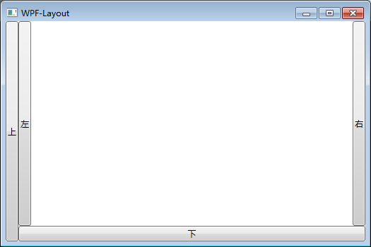
设置LastChildFill属性为false
1 2 3 4 5 6 <DockPanel LastChildFill ="False" > <Button Content ="上" DockPanel.Dock ="Left" > </Button > <Button Content ="下" DockPanel.Dock ="Bottom" > </Button > <Button Content ="左" DockPanel.Dock ="Left" > </Button > <Button Content ="右" DockPanel.Dock ="Right" > </Button > </DockPanel >
Grid布局
功能最强大的布局。
默认情况下,Grid的子元素会自动调整大小占满其所在单元格。你通常不需要为其设置大小,它的大小会根据所在单元格变化而与单元格保持一致。
你也可以通过设置子元素的Margin 属性来设定其与单元格边距距离。
Grid允许我们通过自定义行列来进行布局,这类似于表格.通过定义Grid的RowDifinitions和ColumnDifinitions来实现对于表格行和列的定义
元素根据附加属性Grid.Row和Grid.Column确定自己的位置。
Grid的列宽与行高可采用固定、自动、按比列三种方式定义
固定长度 ——值为一个确定的数字自动长度 ——值为Auto,实际作用就是取实际控件所需的最小值比例长度 ——*表示占用剩余的全部宽度;两行都是*,将平分剩余宽度;一个2*,一个*,则前者占剩余全部宽度的2/3,后者占1/3;依此类推
1 2 3 4 5 6 7 8 9 10 11 12 <Grid > <Grid.RowDefinitions > <RowDefinition Height ="40" > </RowDefinition > <RowDefinition Height ="Auto" > </RowDefinition > <RowDefinition Height ="2*" > </RowDefinition > <RowDefinition Height ="*" > </RowDefinition > </Grid.RowDefinitions > <Button Grid.Row ="0" Content ="Button 1" > </Button > <Button Grid.Row ="1" Content ="Button 2" > </Button > <Button Grid.Row ="2" Content ="Button 3" > </Button > <Button Grid.Row ="3" Content ="Button 4" > </Button > </Grid >
局限较大,只适合等分的情况。
UniformGrid就是Grid的简化版,每个单元格的大小相同,不需要定义行列集合。每个单元格始终具有相同的大小,每个单元格只能容纳一个控件。
UniformGrid 中没有Row和Column附加属性,也没有空白单元格。
1 2 3 4 5 6 7 8 9 <UniformGrid > <Button Content ="Button" > </Button > <Button Content ="Button" > </Button > <Button Content ="Button" > </Button > <Button Content ="Button" > </Button > <Button Content ="Button" > </Button > <Button Content ="Button" > </Button > <Button Content ="Button" > </Button > </UniformGrid >
如果设置列数 行高会均分
1 2 3 4 5 6 7 8 9 10 <UniformGrid Margin ="16,0,16,0" Columns ="1" > <Button HorizontalAlignment ="Left" Content ="Button" /> <Button HorizontalAlignment ="Left" Content ="Button" /> <Button HorizontalAlignment ="Left" Content ="Button" /> <Button HorizontalAlignment ="Left" Content ="Button" /> <Button HorizontalAlignment ="Left" Content ="Button" /> <Button HorizontalAlignment ="Left" Content ="Button" /> <Button HorizontalAlignment ="Left" Content ="Button" /> <Button HorizontalAlignment ="Left" Content ="Button" /> </UniformGrid >
动态容器
ItemsControl
ListBox
ListView
DataGrid
ItemsControl、ListBox和ListView ItemsControl=>ListBox=>ListView
ListView继承于ListBox,ListBox继承于ItemsControl,所以后面的组件拥有前面组件的一切特性。
相同点:
这三个控件都是列表型控件,可以进行列表绑定(ItemsSource);
这三个控件均使用ItemsPresenter来展示列表信息;
不同点:
ItemsControl是不包含水平和垂直方向的滚动条的。ListBox和ListView有水平和垂直方向滚动条。
ListBox 继承于ItemsControl,增加了一个Selector对象,ItemsControl中的Item是不支持选择的。
而ListBox中Item是支持选择,并且可以单选,多选。
ListView类似 Gridview ,支持多列
ListBox很简单, 就一列
ListView和DataGrid
ListView 理解为只读控件,更像是一种View(视图),而DataGrid更倾向于编辑数据。
DataGrid允许自动生成列,ListView不行。
DataGrid有RowDetails元素, ListView没有。
DataGrid支持所有ListView支持的东西。
ListBox 水平方向填满 ListView其实就是表格组件,ItemsControl不支持内容滚动,所以我们最常用的就是ListBox.
模板和样式
1 2 3 4 5 6 7 8 9 10 11 12 13 14 15 16 17 18 19 20 21 22 23 24 25 26 27 28 29 30 31 32 33 <Window.Resources > <Style x:Key ="ListBoxItemContainerStyle" TargetType ="{x:Type ListBoxItem}" > <Setter Property ="HorizontalContentAlignment" Value ="Stretch" /> <Setter Property ="HorizontalAlignment" Value ="Stretch" /> <Setter Property ="Template" > <Setter.Value > <ControlTemplate TargetType ="{x:Type ListBoxItem}" > <Border Background ="Transparent" BorderBrush ="Transparent" BorderThickness ="0" > <ContentPresenter /> </Border > <ControlTemplate.Triggers /> </ControlTemplate > </Setter.Value > </Setter > </Style > <ControlTemplate x:Key ="ListBoxTpl" > <ScrollViewer HorizontalScrollBarVisibility ="Disabled" VerticalScrollBarVisibility ="Hidden" > <StackPanel IsItemsHost ="True" Orientation ="Vertical" ScrollViewer.CanContentScroll ="False" /> </ScrollViewer > </ControlTemplate > <DataTemplate x:Key ="QuesItemTmp" > <DockPanel > </DockPanel > </DataTemplate > </Window.Resources >
页面中使用
1 2 3 4 5 6 7 <ListBox BorderThickness ="0" ItemContainerStyle ="{StaticResource ListBoxItemStyle}" ItemTemplate ="{StaticResource QuesItemTmp}" ItemsSource ="{Binding quesList}" Template ="{StaticResource ListBoxTpl}" > </ListBox >
行内样式和单独样式对比 1 2 3 4 5 6 7 8 <ListBox > <ListBox.ItemContainerStyle > <Style TargetType ="{x:Type ListBoxItem}" > <Setter Property ="HorizontalContentAlignment" Value ="Stretch" /> <Setter Property ="HorizontalAlignment" Value ="Stretch" /> </Style > </ListBox.ItemContainerStyle > </ListBox >
等同于
1 2 <ListBox ItemContainerStyle ="{StaticResource ListBoxItemStyle}" > </ListBox >
以及
1 2 3 4 5 6 <Window.Resources > <Style x:Key ="ListBoxItemStyle" TargetType ="ListBoxItem" > <Setter Property ="HorizontalContentAlignment" Value ="Stretch" /> <Setter Property ="HorizontalAlignment" Value ="Stretch" /> </Style > </Window.Resources >
修改选中样式 1 2 3 4 5 6 7 8 9 10 11 12 13 14 15 16 17 18 19 20 21 22 23 24 25 26 27 28 29 30 31 32 <ListBox x:Name ="toolbar_listTwo" Grid.Row ="4" Margin ="0,10,0,0" Background ="Beige" BorderThickness ="0" ItemTemplate ="{StaticResource QuesItemTmp}" ItemsSource ="{Binding quesList, Mode=TwoWay}" ScrollViewer.HorizontalScrollBarVisibility ="Disabled" ScrollViewer.VerticalScrollBarVisibility ="Hidden" > <ListBox.ItemContainerStyle > <Style TargetType ="{x:Type ListBoxItem}" > <Setter Property ="HorizontalContentAlignment" Value ="Stretch" /> <Setter Property ="HorizontalAlignment" Value ="Stretch" /> <Setter Property ="Template" > <Setter.Value > <ControlTemplate TargetType ="{x:Type ListBoxItem}" > <Border x:Name ="itemBox" Background ="Transparent" BorderBrush ="Transparent" BorderThickness ="0" > <ContentPresenter /> </Border > <ControlTemplate.Triggers /> </ControlTemplate > </Setter.Value > </Setter > </Style > </ListBox.ItemContainerStyle > </ListBox >
滚动条设置
1 2 ScrollViewer.HorizontalScrollBarVisibility="Disabled" ScrollViewer.VerticalScrollBarVisibility="Hidden"
全局样式 StyleListBoxItem.xaml
1 2 3 4 5 6 7 8 9 10 11 12 13 14 15 16 17 18 19 20 21 22 23 24 25 26 27 28 <ResourceDictionary xmlns ="http://schemas.microsoft.com/winfx/2006/xaml/presentation" xmlns:x ="http://schemas.microsoft.com/winfx/2006/xaml" > <Style x:Key ="ListBoxItemContainerStyle1" TargetType ="ListBoxItem" > <Setter Property ="SnapsToDevicePixels" Value ="true" /> <Setter Property ="FocusVisualStyle" Value ="{x:Null}" /> <Setter Property ="Template" > <Setter.Value > <ControlTemplate TargetType ="ListBoxItem" > <Border Name ="Border" Padding ="7" Background ="Transparent" SnapsToDevicePixels ="True" > <ContentPresenter /> </Border > <ControlTemplate.Triggers > <Trigger Property ="IsSelected" Value ="true" > <Setter TargetName ="Border" Property ="Background" Value ="Transparent" /> <Setter Property ="Foreground" Value ="Black" /> </Trigger > <Trigger Property ="IsEnabled" Value ="false" > <Setter Property ="Foreground" Value ="LightGray" /> </Trigger > </ControlTemplate.Triggers > </ControlTemplate > </Setter.Value > </Setter > </Style > </ResourceDictionary >
OverwrideDefaultControlStyles.xaml
1 2 3 4 5 6 7 8 <ResourceDictionary xmlns ="http://schemas.microsoft.com/winfx/2006/xaml/presentation" xmlns:x ="http://schemas.microsoft.com/winfx/2006/xaml" > <ResourceDictionary.MergedDictionaries > <ResourceDictionary Source ="pack://application:,,,/Resources/StyleListBoxItem.xaml" /> </ResourceDictionary.MergedDictionaries > <Style BasedOn ="{StaticResource ListBoxItemContainerStyle1}" TargetType ="ListBoxItem" /> </ResourceDictionary >
注意
这里这样配置会全局生效,可以把第7行删掉,使用下面的方式引用
Application
1 2 3 <Application.Resources > <ResourceDictionary Source ="pack://application:,,,/Resources/OverwrideDefaultControlStyles.xaml" /> </Application.Resources >
使用
1 2 3 4 5 6 7 8 9 10 11 <ListBox x:Name ="ltbImage" Grid.Row ="2" Margin ="11,0,10,0" BorderThickness ="0" ItemContainerStyle ="{StaticResource ListBoxItemContainerStyle1}" ItemTemplate ="{StaticResource UserImage}" ItemsSource ="{Binding list}" ScrollViewer.HorizontalScrollBarVisibility ="Disabled" ScrollViewer.VerticalScrollBarVisibility ="Hidden" > </ListBox >
ListView 官方讲解: https://docs.microsoft.com/zh-cn/previous-versions/dotnet/netframework-3.5/ms771469(v=vs.90)?redirectedfrom=MSDN
就是类似网页中的表格
1 2 3 4 5 6 7 8 9 10 11 <ListView x:Name ="listView1" BorderThickness ="0" FontSize ="20" > <ListView.View > <GridView > <GridViewColumn Header ="序列号" Width ="120" DisplayMemberBinding ="{Binding book_id}" /> <GridViewColumn Header ="书名" Width ="100" DisplayMemberBinding ="{Binding book_name}" /> <GridViewColumn Header ="类型" Width ="80" DisplayMemberBinding ="{Binding book_type}" /> </GridView > </ListView.View > </ListView >
结论
该组件不常用,主要原因是样式不太好调
如果做后台管理可以考虑,前端展示还是别用了。
单双行变色 方法1 定义使用 IValueConverter 来使背景色产生交替效果的样式
下面的示例显示依据行索引设置 Background 属性的 IValueConverter 的定义。
C#
1 2 3 4 5 6 7 8 9 10 11 12 13 14 15 16 17 18 19 20 21 22 public sealed class BackgroundConverter : IValueConverter { public object Convert (object value , Type targetType, object parameter, CultureInfo culture ) { ListViewItem item = (ListViewItem)value ; ListView listView = ItemsControl.ItemsControlFromItemContainer(item) as ListView; int index = listView.ItemContainerGenerator.IndexFromContainer(item); if (index % 2 == 0 ) { return Brushes.LightBlue; } else { return Brushes.Beige; } } }
样式
1 2 3 4 5 6 7 8 <Style x:Key="myItemStyle" TargetType="{x:Type ListViewItem}"> <Setter Property="Background"> <Setter.Value> <Binding RelativeSource="{RelativeSource Self}" Converter="{StaticResource myConverter}"/> </Setter.Value> </Setter> </Style>
下面的示例为 IValueConverter 定义 ResourceKey。
XAML
1 <namespc:BackgroundConverter x:Key="myConverter"/>
下面的示例演示如何定义使用 Style 作为其 ItemContainerStyle 以便提供所需布局的 ListView。
XAML
1 2 3 4 5 6 7 8 9 10 11 12 13 14 15 <ListView Name ="theListView" ItemsSource ="{Binding Source={StaticResource EmployeeData}, XPath=Employee}" ItemContainerStyle ="{StaticResource myItemStyle}" > <ListView.View > <GridView > <GridViewColumn DisplayMemberBinding ="{Binding XPath=FirstName}" Header ="First Name" Width ="120" /> <GridViewColumn DisplayMemberBinding ="{Binding XPath=LastName}" Header ="Last Name" Width ="120" /> <GridViewColumn DisplayMemberBinding ="{Binding XPath=FavoriteCity}" Header ="Favorite City" Width ="120" /> </GridView > </ListView.View > </ListView >
方法2 从 ListView 中派生一个新类以使背景色产生交替效果
1 2 3 4 5 6 7 8 9 10 11 12 13 14 15 16 17 18 19 20 21 22 public class SubListView : ListView { protected override void PrepareContainerForItemOverride (DependencyObject element, object item ) { base .PrepareContainerForItemOverride(element, item); if (View is GridView) { int index = ItemContainerGenerator.IndexFromContainer(element); ListViewItem lvi = element as ListViewItem; if (index % 2 == 0 ) { lvi.Background = Brushes.LightBlue; } else { lvi.Background = Brushes.Beige; } } } }
XAML
1 2 3 4 5 6 7 8 9 10 11 12 13 14 15 16 17 18 19 20 <namespc:SubListView ItemsSource="{Binding Source={StaticResource EmployeeData}, XPath=Employee}"> <namespc:SubListView.View> <GridView> <GridViewColumn DisplayMemberBinding="{Binding XPath=FirstName}" Header="First Name" Width="120"/> <GridViewColumn DisplayMemberBinding="{Binding XPath=LastName}" Header="Last Name" Width="120"/> <GridViewColumn DisplayMemberBinding="{Binding XPath=FavoriteCity}" Header="Favorite City" Width="120"/> </GridView> </namespc:SubListView.View> </namespc:SubListView>
方法3 使用 StyleSelector 使背景色产生交替效果
下面的示例演示如何定义一个为行定义 Style 的 StyleSelector。此示例依据行索引定义 Background 颜色。
C#
1 2 3 4 5 6 7 8 9 10 11 12 13 14 15 16 17 18 19 20 21 22 23 24 25 26 public class ListViewItemStyleSelector : StyleSelector { public override Style SelectStyle (object item, DependencyObject container ) { Style st = new Style(); st.TargetType = typeof (ListViewItem); Setter backGroundSetter = new Setter(); backGroundSetter.Property = ListViewItem.BackgroundProperty; ListView listView = ItemsControl.ItemsControlFromItemContainer(container) as ListView; int index = listView.ItemContainerGenerator.IndexFromContainer(container); if (index % 2 == 0 ) { backGroundSetter.Value = Brushes.LightBlue; } else { backGroundSetter.Value = Brushes.Beige; } st.Setters.Add(backGroundSetter); return st; } }
下面的示例演示如何为 StyleSelector 定义 ResourceKey。namespc 前缀映射到 CLR 命名空间和其中定义了 StyleSelector 的对应程序集。有关更多信息,请参见 XAML 命名空间和命名空间映射。
XAML 复制代码
1 <namespc:ListViewItemStyleSelector x:Key ="myStyleSelector" />
下面的示例演示如何将 ListView 的 ItemContainerStyleSelector 属性设置为此 StyleSelector 资源。
XAML
1 2 3 4 5 6 7 8 9 10 11 12 13 14 15 <ListView ItemsSource ="{Binding Source={StaticResource EmployeeData}, XPath=Employee}" ItemContainerStyleSelector ="{DynamicResource myStyleSelector}" > <ListView.View > <GridView > <GridViewColumn DisplayMemberBinding ="{Binding XPath=FirstName}" Header ="First Name" Width ="120" /> <GridViewColumn DisplayMemberBinding ="{Binding XPath=LastName}" Header ="Last Name" Width ="120" /> <GridViewColumn DisplayMemberBinding ="{Binding XPath=FavoriteCity}" Header ="Favorite City" Width ="120" /> </GridView > </ListView.View > </ListView >
在 ListViewItem 集合中进行更改后更新 ListView
如果从 ListView 控件中添加或移除 ListViewItem,您必须更新 ListViewItem 控件以便重新创建交替的 Background 颜色。下面的示例演示如何更新 ListViewItem 控件。
C#
1 2 3 ICollectionView dataView = CollectionViewSource.GetDefaultView(theListView.ItemsSource); dataView.Refresh();
单子组件容器 ScrollViewer是带有滚动条的面板。在ScrollViewer中只能有一个子控件,若要显示多个子控件,需要将一个附加的 Panel控件放置在父 ScrollViewer中。然后可以将子控件放置在该控件中。
1 2 3 <ScrollViewer HorizontalScrollBarVisibility ="Auto" VerticalScrollBarVisibility ="Auto" > <Button Content ="Button" Width ="800" Height ="800" > </Button > </ScrollViewer >
ViewBox布局 https://docs.microsoft.com/zh-cn/dotnet/api/system.windows.controls.viewbox?view=netframework-4.8
Viewbox的作用是拉伸或延展位于其中的组件,以填满可用空间。在Viewbox中只能有一个子控件,若要显示多个子控件,需要将一个附加的Panel控件放置在父Viewbox中。然后可以将子控件放置在该控件中。
常用属性:
Stretch :获取或设置拉伸模式以决定该组件中的内容以怎样的形式填充该组件的已有空间。具体设置值如下:
值
作用
None
不进行拉伸,按子元素设置的长宽显示
Uniform
按原比例缩放子元素,使得一边不足,另一边恰好填充
Fill
缩放子元素,使得子元素的长变为Viewbox的长,宽变为Viewbox的宽
UniformToFill
按原比例缩放子元素,使得子元素一边恰好填充,另一边超出Viewbox的区域
StretchDirection :获取或设置该组件的拉伸方向以决定该组件中的内容将以何种形式被延展。具体的设置值如下。
值
作用
Both
内容将根据 Stretch 模式进行拉伸以适应父级。
DownOnly
内容仅在大于父级时缩放。 如果内容较小,则不会执行任何扩展。
UpOnly
内容仅在小于父级时扩展。 如果内容较大,则不执行缩放。
Stretch默认值为Uniform。
1 2 3 <Viewbox Grid.Row ="0" Grid.Column ="1" Stretch ="Uniform" > <Button Width ="100" Height ="50" Content ="Uniform" > </Button > </Viewbox >
注意Stretch默认值为Uniform`
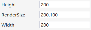
假如我们按如下设置
1 2 3 <Viewbox Width ="200" Height ="200" > <Image Width ="100" Height ="50" /> </Viewbox >
那么实际结果Viewbox的尺寸是
也就是说Viewbox设置的宽高只代表我占个多大的地,实际渲染的时候会根据子组件的宽高变化。
Border Border 是一个装饰的控件,此控件用于绘制边框及背景,在Border中只能有一个子控件,若要显示多个子控件,需要将一个附加的Panel控件放置在父Border中。然后可以将子控件放置在该 Panel控件中。
常用属性:
Background: 背景色 ;
BorderBrush: 边框色 ;
BorderThickness: 边框宽度;
CornerRadius: 各个角 圆的半径;
1 2 <Border Background ="YellowGreen" BorderBrush ="Black" BorderThickness ="0, 2, 4, 6" CornerRadius ="0, 10, 20, 30" > </Border >
设置阴影
1 2 3 4 5 6 7 8 9 10 11 12 13 14 15 <views:ZJClippingBorder Margin ="10" Background ="#4597FF" BorderBrush ="#4597FF" BorderThickness ="5" CornerRadius ="10,10,10,10" SnapsToDevicePixels ="true" > <Border.Effect > <DropShadowEffect BlurRadius ="10" Opacity ="1" ShadowDepth ="0" Color ="#cccccc" /> </Border.Effect > </views:ZJClippingBorder >
其中
要设置Margin值让边缘的阴影不被裁剪。
内部元素会变模糊,建议阴影的这一层放下面,把内部的放在上一层。
SnapsToDevicePixels和UseLayoutRounding均是解决边缘模糊的问题
默认的Border不能剪切内部元素,自定义border支持内部剪切
1 2 3 4 5 6 7 8 9 10 11 12 13 14 15 16 17 18 19 20 21 22 23 24 25 26 27 28 29 30 31 32 33 34 35 36 37 38 39 40 41 42 43 44 45 46 47 48 49 50 51 52 53 54 55 56 57 58 59 60 61 62 63 64 65 66 67 68 69 70 71 72 73 74 75 76 77 78 79 80 81 82 83 84 85 86 87 88 89 90 91 92 93 94 95 96 97 98 99 100 101 102 103 using System;using System.Collections.Generic;using System.Linq;using System.Text;using System.Windows.Controls;using System.Windows.Media;using System.Windows;namespace ZJClassTool.Views { public class ClippingBorder : Border { protected override void OnRender (DrawingContext dc ) { OnApplyChildClip(); base .OnRender(dc); } public override UIElement Child { get { return base .Child; } set { if (Child != value ) { if (Child != null ) { Child.SetValue(ClipProperty, _oldClip); } if (value != null ) { _oldClip = value .ReadLocalValue(ClipProperty); } else { _oldClip = null ; } base .Child = value ; } } } protected virtual void OnApplyChildClip () { UIElement child = Child; if (child != null ) { var top = Math.Max(CornerRadius.TopLeft, CornerRadius.TopRight); var bottom = Math.Max(CornerRadius.BottomLeft, CornerRadius.BottomRight); var max = Math.Max(top, bottom); var size = RenderSize; var width = size.Width - (BorderThickness.Left + BorderThickness.Right); var height = size.Height - (BorderThickness.Top + BorderThickness.Bottom); Geometry result = new RectangleGeometry (new Rect(0 , 0 , width, height), max, max); double halfWidth = width / 2 ; double halfHeight = height / 2 ; if (CornerRadius.TopLeft == 0 ) { result = new CombinedGeometry( GeometryCombineMode.Union, result, new RectangleGeometry(new Rect(0 , 0 , halfWidth, halfHeight)) ); } if (CornerRadius.TopRight == 0 ) { result = new CombinedGeometry(GeometryCombineMode.Union, result, new RectangleGeometry (new Rect(halfWidth, 0 , halfWidth, halfHeight))); } if (CornerRadius.BottomLeft == 0 ) { result = new CombinedGeometry (GeometryCombineMode.Union, result, new RectangleGeometry (new Rect(0 , halfHeight, halfWidth, halfHeight))); } if (CornerRadius.BottomRight == 0 ) { result = new CombinedGeometry (GeometryCombineMode.Union, result, new RectangleGeometry (new Rect(halfWidth, halfHeight, halfWidth, halfHeight))); } child.Clip = result; } } public void Update () private RectangleGeometry _clipRect = new RectangleGeometry(); private object _oldClip; } }
定位常用属性 在设计UI时,WPF为我们提供了一些属性用于精确定位元素
其中最常用的有三个:Alignment(包括水平,垂直),Margin,Padding,
具体用法如下:
HorizontalAlignment: 子元素在水平方向的对齐方式,有左对齐,右对齐,中间对齐,拉伸填充等四种方式。
VerticalAlignment:子元素在垂直方向的对齐方式,有顶端对齐,底部对齐,中间对齐,拉伸填充等四种方式。
Margin:用于指定元素与其父级或同级之间的距离,包括上下左右四个值。也可通过使用 Margin=”20”同时指定四个值。
Padding:用于指定元素与其子级之间的距离,包括上下左右四个值。也可通过使用Padding=”20”同时指定四个值。
内容定位
1 2 VerticalContentAlignment="Center" HorizontalContentAlignment="Center"