前言
除了布局组件外,Jetpack Compose 还提供了一系列其他常用的 UI 组件。
组件
https://developer.android.google.cn/jetpack/compose/components?hl=zh-cn
入门教程
https://developer.android.google.cn/courses/pathways/compose?hl=zh-cn
按钮
基本使用
1
2
3
4
5
6
7
8
9
10
11
| Button(
modifier = Modifier.width(100.dp).height(40.dp),
shape = MaterialTheme.shapes.medium,
onClick = { }
) {
Text(
text = "点击",
fontSize = 16.sp,
color = Color.White
)
}
|
默认的按钮是圆角的,所以这里不使用Button来改自定义效果。
颜色渐变
1
2
3
4
5
6
7
8
9
10
11
12
13
14
15
16
17
18
19
20
21
22
23
24
25
26
27
28
29
30
31
32
33
34
35
36
37
38
39
40
41
42
43
44
45
46
47
48
49
50
51
52
53
54
55
56
57
58
59
60
61
62
63
64
| import androidx.compose.foundation.background
import androidx.compose.foundation.border
import androidx.compose.foundation.clickable
import androidx.compose.foundation.layout.Box
import androidx.compose.foundation.layout.fillMaxSize
import androidx.compose.foundation.layout.wrapContentSize
import androidx.compose.foundation.shape.RoundedCornerShape
import androidx.compose.material3.Text
import androidx.compose.runtime.Composable
import androidx.compose.ui.Alignment
import androidx.compose.ui.Modifier
import androidx.compose.ui.draw.clip
import androidx.compose.ui.draw.shadow
import androidx.compose.ui.graphics.Brush
import androidx.compose.ui.graphics.Color
import androidx.compose.ui.text.TextStyle
import androidx.compose.ui.text.style.TextAlign
import androidx.compose.ui.unit.dp
import androidx.compose.ui.unit.sp
@Composable
fun LoginBtn(text: String, clickEvent: () -> Unit) {
val mShape = RoundedCornerShape(10.dp)
Box(
modifier = Modifier
.fillMaxSize()
.background(
brush = Brush.horizontalGradient(
colors = listOf(
Color(0xff24adfa),
Color(0x0ac2ff05),
),
startX = 0f,
),
shape = mShape
)
.border(
width = 0.5.dp,
brush = Brush.linearGradient(
colors = listOf(Color(0xffADC9D9), Color(0xffADC9D9)),
start = androidx.compose.ui.geometry.Offset(0f, 0f),
end = androidx.compose.ui.geometry.Offset(100f, 100f)
),
shape = mShape
)
.clip(mShape)
.clickable {
clickEvent()
}
) {
Text(
text = text,
color = Color.White,
style = TextStyle(fontSize = 24.sp),
textAlign = TextAlign.Center,
modifier = Modifier
.align(Alignment.Center)
.wrapContentSize(Alignment.Center),
)
}
}
|
背景色
- 推荐使用
ButtonDefaults.buttonColors:它会自动处理按钮的各种状态(按压、禁用等),且符合 Material Design 设计规范。
containerColor 参数:在 Material3 中,containerColor 用于设置按钮的背景色(替代了 Material2 中的 backgroundColor)。- 自定义背景时:需将
containerColor 设为 Color.Transparent 以清除默认背景,避免样式冲突。
- 形状一致性:自定义背景时建议使用
ButtonDefaults.shape 保持默认圆角,或通过 shape 参数指定自定义形状。
示例
1
2
3
4
5
6
7
8
9
10
11
12
13
14
15
16
| Button(
modifier = Modifier
.padding(top = 40.dp)
.fillMaxWidth()
.height(55.dp)
.clip(CommonTheme.CornerFull),
colors = ButtonDefaults.buttonColors(
containerColor = Color(0x55ffffff),
),
onClick = {
val intent = Intent(baseContext, MainActivity::class.java)
intent.putExtra("name", "张三")
startActivity(intent)
}) {
Text("立即登录", fontSize = 24.sp, color = Color(0xff253A70))
}
|
注意
通过background设置是不生效的。
自定义按钮
效果

组件定义
1
2
3
4
5
6
7
8
9
10
11
12
13
14
15
16
17
18
19
20
21
22
23
24
25
26
27
28
29
30
31
32
33
34
35
36
37
38
39
40
41
42
43
44
45
46
47
48
49
50
51
52
53
54
55
56
57
58
59
60
61
62
63
64
65
66
67
68
69
| import androidx.compose.foundation.background
import androidx.compose.foundation.clickable
import androidx.compose.foundation.layout.Box
import androidx.compose.foundation.layout.fillMaxSize
import androidx.compose.foundation.layout.padding
import androidx.compose.foundation.layout.size
import androidx.compose.foundation.layout.wrapContentSize
import androidx.compose.foundation.shape.RoundedCornerShape
import androidx.compose.material3.Text
import androidx.compose.runtime.Composable
import androidx.compose.ui.Alignment
import androidx.compose.ui.Modifier
import androidx.compose.ui.draw.clip
import androidx.compose.ui.graphics.Brush
import androidx.compose.ui.graphics.Color
import androidx.compose.ui.text.TextStyle
import androidx.compose.ui.text.style.TextAlign
import androidx.compose.ui.tooling.preview.Preview
import androidx.compose.ui.unit.dp
import androidx.compose.ui.unit.sp
@Composable
fun ZBtnView(text:String){
val mShape = RoundedCornerShape(6.dp)
Box(
modifier = Modifier
.fillMaxSize()
.clip(mShape)
) {
Box(
modifier = Modifier
.padding(0.dp,6.dp,0.dp,0.dp)
.fillMaxSize()
.background(
Color(0xff2B89E0),
shape =mShape
)
.clip(mShape)
)
Box(
modifier = Modifier
.padding(0.dp,0.dp,0.dp,2.5.dp)
.fillMaxSize()
.background(
brush = Brush.verticalGradient(
colors = listOf(
Color(0xff8AEFFD),
Color(0xff3BD9FD),
Color(0xff32C8FD),
Color(0xff36B3FE),
Color(0xff50B8FF),
),
startY = 0f,
),
shape = mShape
)
.clip(mShape)
)
Text(
text = text,
color = Color.White,
style = TextStyle(fontSize = 14.sp),
textAlign = TextAlign.Center,
modifier = Modifier
.align(Alignment.Center)
.wrapContentSize(Alignment.Center),
)
}
}
|
使用
1
2
3
4
5
6
7
8
| Box(
modifier = Modifier
.align(Alignment.Bottom)
.size(72.dp, 28.dp)
.clip(RoundedCornerShape(6.dp))
.clickable { }) {
ZBtnView("安装")
}
|
点击去涟漪/防止连点
1
2
3
4
5
6
7
8
9
10
11
12
13
14
15
16
17
18
19
20
21
22
23
24
25
26
27
28
29
30
31
32
33
34
35
36
37
38
39
| import android.annotation.SuppressLint
import androidx.compose.foundation.clickable
import androidx.compose.foundation.interaction.MutableInteractionSource
import androidx.compose.runtime.LaunchedEffect
import androidx.compose.runtime.getValue
import androidx.compose.runtime.mutableStateOf
import androidx.compose.runtime.remember
import androidx.compose.runtime.setValue
import androidx.compose.ui.Modifier
import androidx.compose.ui.composed
import kotlinx.coroutines.delay
@SuppressLint("ModifierFactoryUnreferencedReceiver")
inline fun Modifier.noRippleClickable(crossinline onClick: () -> Unit): Modifier = composed {
clickable(
indication = null,
interactionSource = remember { MutableInteractionSource() }) {
onClick()
}
}
@SuppressLint("ModifierFactoryUnreferencedReceiver")
fun Modifier.debouncedClickable(delay: Long = 500, onClick: () -> Unit) = composed {
var canClick by remember {
mutableStateOf(true)
}
LaunchedEffect(key1 = canClick, block = {
if (!canClick) {
delay(delay)
canClick = true
}
})
Modifier.clickable(canClick) {
canClick = false
onClick()
}
}
|
单选按钮
1
2
3
4
5
6
7
8
| @Composable
fun MyRadioBtn(onSelectChange: (Boolean) -> Unit) {
val isSelected = remember {mutableStateOf(false)}
RadioButton(selected = isSelected.value, onClick = {
isSelected.value = !isSelected.value
onSelectChange(isSelected.value)
})
}
|
单选自定义
效果
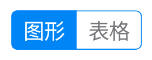
代码
1
2
3
4
5
6
7
8
9
10
11
12
13
14
15
16
17
18
19
20
21
22
23
24
25
26
27
28
29
30
31
32
33
34
35
36
37
38
39
40
41
42
43
44
45
46
47
48
49
50
51
52
53
54
55
56
57
58
59
60
61
62
63
64
65
66
67
68
69
70
71
72
73
| import androidx.compose.foundation.background
import androidx.compose.foundation.border
import androidx.compose.foundation.clickable
import androidx.compose.foundation.layout.Box
import androidx.compose.foundation.layout.Row
import androidx.compose.foundation.layout.fillMaxHeight
import androidx.compose.foundation.layout.height
import androidx.compose.foundation.layout.padding
import androidx.compose.foundation.layout.wrapContentWidth
import androidx.compose.foundation.shape.RoundedCornerShape
import androidx.compose.material3.Text
import androidx.compose.runtime.Composable
import androidx.compose.runtime.MutableState
import androidx.compose.runtime.mutableStateOf
import androidx.compose.ui.Alignment
import androidx.compose.ui.Modifier
import androidx.compose.ui.draw.clip
import androidx.compose.ui.graphics.Color
import androidx.compose.ui.text.style.TextAlign
import androidx.compose.ui.tooling.preview.Preview
import androidx.compose.ui.unit.dp
import androidx.compose.ui.unit.sp
@Composable
fun RadioGroup(
items: List<String>,
selectIndex: MutableState<Int> = mutableStateOf(0),
onSelect: (Int) -> Unit = {}
) {
Row(
modifier = Modifier
.height(26.dp)
.wrapContentWidth()
.clip(RoundedCornerShape(4.dp))
.background(Color.White, RoundedCornerShape(4.dp))
.border(0.5.dp, Color(0xff0085F7), RoundedCornerShape(4.dp))
) {
items.forEachIndexed { index, item ->
Box(
modifier = Modifier
.fillMaxHeight()
.wrapContentWidth()
.background(if (index == selectIndex.value) Color(0xff0085F7) else Color.Transparent)
.clickable {
selectIndex.value = index
onSelect(index)
}
.padding(start = 8.dp, end = 8.dp),
contentAlignment = Alignment.Center
)
{
Text(
text = item,
color = if (index == selectIndex.value) Color.White else Color(0xff75767A),
textAlign = TextAlign.Center,
fontSize = 14.sp
)
}
}
}
}
@Preview
@Composable
fun RadioGroupPreview() {
Box(Modifier.padding(10.dp)){
RadioGroup(
items = listOf("图形", "表格"),
)
}
}
|
Switch
基本示例
1
2
3
4
5
6
7
8
9
10
| @Composable
fun SwitchMinimalExample() {
var checked by remember { mutableStateOf(true) }
Switch(
checked = checked,
onCheckedChange = {
checked = it
}
)
}
|
自定义颜色
1
2
3
4
5
6
7
8
9
10
11
12
13
14
15
16
17
18
19
20
21
| import androidx.compose.material3.Switch
import androidx.compose.material3.SwitchDefaults
import androidx.compose.runtime.getValue
import androidx.compose.runtime.mutableStateOf
import androidx.compose.runtime.remember
import androidx.compose.runtime.setValue
import androidx.compose.ui.graphics.Color
var checked by remember { mutableStateOf(false) }
Switch(
checked = checked,
onCheckedChange = { checked = it },
colors = SwitchDefaults.colors(
uncheckedBorderColor = Color.Gray,
uncheckedThumbColor = Color.Gray,
uncheckedTrackColor = Color.White,
checkedThumbColor = Color.White,
checkedTrackColor = Color(0xFF6200EE)
)
)
|
其中可自定义项
uncheckedBorderColor: 关闭状态下边框的颜色uncheckedThumbColor: 关闭状态下滑块的颜色uncheckedTrackColor: 关闭状态下轨道的颜色checkedThumbColor: 开启状态下滑块(thumb)的颜色checkedTrackColor: 开启状态下轨道(track)的颜色disabledCheckedThumbColor: 禁用且开启时的滑块颜色disabledUncheckedThumbColor: 禁用且关闭时的滑块颜色disabledCheckedTrackColor: 禁用且开启时的轨道颜色disabledUncheckedTrackColor: 禁用且关闭时的轨道颜色
自定义大小
Material 3 的 Switch 尺寸为 52×32 dp。
若需微调,用 scale:如 0.9f ~ 1.2f 范围内调整。
假如要调整到高度 28.dp
1
2
3
4
5
6
7
8
9
10
11
12
13
14
| import androidx.compose.foundation.layout.scale
import androidx.compose.material3.Switch
import androidx.compose.runtime.getValue
import androidx.compose.runtime.mutableStateOf
import androidx.compose.runtime.remember
import androidx.compose.runtime.setValue
var checked by remember { mutableStateOf(false) }
Switch(
checked = checked,
onCheckedChange = { checked = it },
modifier = Modifier.scale(28f / 32f)
)
|
注意
不要使用 Modifier.size() 强制设置宽高, Switch 内部依旧会使用固定尺寸绘制,强行限制容器大小会导致内容被裁剪或显示异常。
使用 Modifier.scale() 不会改变组件在布局中占用的空间(layout size),它只是在绘制时对内容进行视觉缩放,布局尺寸仍为原始大小。