Ant Design Vue使用中的注意项

官网

https://1x.antdv.com/components/icon-cn

引用

1
npm i --save ant-design-vue

全局引用

1
2
3
import Antd from 'ant-design-vue';
import 'ant-design-vue/dist/antd.css';
Vue.use(Antd);
1
2
3
4
5
6
7
8
9
10
11
12
13
module.exports = {
presets: ["@vue/cli-plugin-babel/preset"],
plugins: [
[
"import",
{
libraryName: "ant-design-vue",
libraryDirectory: "es",
style: true,
},
],
],
};

提示消息

1
2
3
4
5
6
import { message } from "ant-design-vue";

message.info('This is a normal message');
message.success('This is a success message');
message.error('This is an error message');
message.warning('This is a warning message');

或者全局

1
2
3
4
5
6
this.$message.info(res.msg);
this.$message.success(res.msg);
this.$message.error(res.msg);
this.$message.warning(res.msg);
this.$message.warn(res.msg);
this.$message.loading("加载中...");

Button

1
2
3
4
5
6
7
8
9
<a-button icon="search" type="primary">查询</a-button>
<a-button type="danger">
Danger
</a-button>
<a-button icon="reload">重置</a-button>
<a-button icon="vertical-align-top" disabled>重发</a-button>

<a-button icon="close" @click="closeBtnCLick">取消</a-button>
<a-button icon="plus" html-type="submit" type="primary">新增</a-button>

自定义图标

1
<a-button type="primary"> <a-icon type="left" />Go back </a-button>

Row/Col

Flex 布局是基于 24 栅格来定义每一个『盒子』的宽度,但不拘泥于栅格。

1
2
3
4
5
6
7
8
9
10
11
12
13
14
<a-row type="flex" justify="center" align="top">
<a-col :span="4">

</a-col>
<a-col :span="4">

</a-col>
<a-col :span="4">

</a-col>
<a-col :span="4">

</a-col>
</a-row>

方式2

1
2
3
4
<a-row type="flex" :gutter="[10,10]">
<a-col flex="100px">100px</a-col>
<a-col flex="auto">auto</a-col>
</a-row>

Row

成员 说明 类型 默认值
align flex 布局下的垂直对齐方式:top middle bottom string top
gutter 栅格间隔,可以写成像素值或支持响应式的对象写法来设置水平间隔 { xs: 8, sm: 16, md: 24}。或者使用数组形式同时设置 [水平间距, 垂直间距]1.5.0 后支持)。 number/object/array 0
justify flex 布局下的水平排列方式:start end center space-around space-between string start
wrap 是否自动换行 boolean false

Col

成员 说明 类型 默认值 版本
flex flex 布局填充 string\ number -
offset 栅格左侧的间隔格数,间隔内不可以有栅格 number 0
order 栅格顺序,flex 布局模式下有效 number 0
pull 栅格向左移动格数 number 0
push 栅格向右移动格数 number 0
span 栅格占位格数,为 0 时相当于 display: none number -
xxxl ≥2000px 响应式栅格,可为栅格数或一个包含其他属性的对象 number\ object - 3.0
xs <576px 响应式栅格,可为栅格数或一个包含其他属性的对象 number\ object -
sm ≥576px 响应式栅格,可为栅格数或一个包含其他属性的对象 number\ object -
md ≥768px 响应式栅格,可为栅格数或一个包含其他属性的对象 number\ object -
lg ≥992px 响应式栅格,可为栅格数或一个包含其他属性的对象 number\ object -
xl ≥1200px 响应式栅格,可为栅格数或一个包含其他属性的对象 number\ object -
xxl ≥1600px 响应式栅格,可为栅格数或一个包含其他属性的对象 number\ object -

Table

https://1x.antdv.com/components/table-cn/#API

基本示例

1
2
3
4
5
6
7
8
9
10
11
12
13
14
15
16
17
18
19
20
21
22
23
24
25
26
27
28
29
30
31
32
33
34
<a-table
:rowKey="(record) => record.id"
:columns="tableHeader"
:data-source="tableData"
:pagination="false"
>
</a-table>

<script>
export default {
name: "system-menu",
data: function () {
return {
tableHeader: [
{
title: "KEY",
dataIndex: "KEY",
key: "KEY",
},
{
title: "VALUE",
dataIndex: "VALUE",
key: "VALUE",
width: 120,
},
],
tableData: [],
};
},
created() {

},
}
</script>

列属性

列描述数据对象,是 columns 中的一项,Column 使用相同的 API。

参数 说明 类型 默认值 版本
align 设置列内容的对齐方式 `’left’ ‘right’ ‘center’` ‘left’
ellipsis 超过宽度将自动省略,暂不支持和排序筛选一起使用。 设置为 true 时,表格布局将变成 tableLayout="fixed" boolean false 1.5.0
colSpan 表头列合并,设置为 0 时,不渲染 number
dataIndex 列数据在数据项中对应的 key,支持 a.b.c 的嵌套写法 string -
defaultFilteredValue 默认筛选值 string[] - 1.5.0
filterDropdown 可以自定义筛选菜单,此函数只负责渲染图层,需要自行编写各种交互 `VNode slot-scope` -
filterDropdownVisible 用于控制自定义筛选菜单是否可见。在 template 中可用 .sync 后缀, 参见 update:filterDropdownVisible boolean -
filtered 标识数据是否经过过滤,筛选图标会高亮 boolean false
filteredValue 筛选的受控属性,外界可用此控制列的筛选状态,值为已筛选的 value 数组 string[] -
filterIcon 自定义 filter 图标。 `VNode (filtered: boolean, column: Column) => vNode slot slot-scope` false
filterMultiple 是否多选 boolean true
filters 表头的筛选菜单项 object[] -
fixed 列是否固定,可选 true(等效于 left) 'left' 'right' `boolean string` false
key Vue 需要的 key。如果没有使用 template 风格的 API,且已经设置了唯一的 dataIndex,可以忽略这个属性 string -
customRender 生成复杂数据的渲染函数,参数分别为当前行的值,当前行数据,行索引,@return 里面可以设置表格行/列合并,可参考 demo 表格行/列合并 `Function(text, record, index) {} slot-scope` -
sorter 排序函数,本地排序使用一个函数(参考 Array.sort 的 compareFunction),需要服务端排序可设为 true `Function boolean` -
sortOrder 排序的受控属性,外界可用此控制列的排序,可设置为 'ascend' 'descend' false `boolean string` -
sortDirections 支持的排序方式,取值为 'ascend' 'descend' Array ['ascend', 'descend'] 1.5.0
title 列头显示文字 `string slot` -
width 列宽度 `string number` -
customCell 设置单元格属性 Function(record, rowIndex) -
customHeaderCell 设置头部单元格属性 Function(column) -
onFilter 本地模式下,确定筛选的运行函数, 使用 template 或 jsx 时作为filter事件使用 Function -
onFilterDropdownVisibleChange @filterDropdownVisibleChange @update:filterDropdownVisible 自定义筛选菜单可见filterDropdownVisible变化时调用,使用 template 或 jsx 时作为filterDropdownVisibleChangeupdate:filterDropdownVisible事件使用 function(visible) {} -
slots 使用 columns 时,可以通过该属性配置支持 slot 的属性,如 slots: { filterIcon: 'XXX'} object -
scopedSlots 使用 columns 时,可以通过该属性配置支持 slot-scope 的属性,如 scopedSlots: { customRender: 'XXX'} object -

Table添加序号

每一页都从1开始

1
2
3
4
5
6
7
8
const tab_header = [
{
title: '序号',
align: 'center',
width: 100,
customRender: (text,record,index) => `${index+1}`,
},
]

分页连续自增序号

1
2
3
4
5
6
7
8
9
10
11
12
13
14
15
16
17
18
19
20
21
22
23
24
25
26
27
28
29
30
31
32
33
34

export default {
name: "Index",
data: function () {
return {
pagination: {
current:1,
total: 0,
pageSize: 10,//每页中显示10条数据
showSizeChanger: true,
pageSizeOptions: ["10", "20", "50", "100"],//每页中显示的数据
showTotal: total => `共有 ${total} 条数据`, //分页中显示总的数据
},
tableHeader: [
{
title: '序号',
align: 'center',
width: 100,
customRender: (text, record, index) => {
//当前页数减1乘以每一页页数再加当前页序号+1
return (`${(this.pagination.current - 1) * (this.pagination.pageSize) + (index + 1)}`)
}
},
{
title: '角色名称',
dataIndex: 'name',
key: 'name',
},

],
tableData: [],
}
}
}

分页

模板

1
2
3
4
5
6
7
8
9
10
11
12
13
14
15
16
<a-table 
:rowKey="record=>record.id"
:columns="tableHeader"
:data-source="tableData"
:pagination="pagination"
@change="handleTableChange">
<template slot="operation" slot-scope="text, record">
<a href="javascript:;" @click="edit_role_click(record)">修改</a>
<a-popconfirm
title="确定要删除吗?"
@confirm="() => del_role_click(record)"
>
<a href="javascript:;">删除</a>
</a-popconfirm>
</template>
</a-table>

JS

1
2
3
4
5
6
7
8
9
10
11
12
13
14
15
16
17
18
19
20
21
22
23
24
25
26
27
28
29
30
31
32
33
34
35
36
37
38
39
40
41
42
43
44
45
46
47
48
export default {
name: "Index",
data: function () {
return {
pagination: {
current:1,
total: 0,
pageSize: 10,//每页中显示10条数据
showSizeChanger: true,
pageSizeOptions: ["10", "20", "50", "100"],//每页中显示的数据
showTotal: total => `共有 ${total} 条数据`, //分页中显示总的数据
},
tableHeader: [
{
title: '角色名称',
dataIndex: 'name',
key: 'name',
},
{
title: '角色代码',
dataIndex: 'code',
key: 'code',
ellipsis: true,
},
{
title: '备注',
dataIndex: 'remark',
key: 'remark',
ellipsis: true,
},
{
title: '操作',
dataIndex: 'operation',
width: 120,
scopedSlots: {customRender: 'operation'},
},
],
tableData: [],
}
},
methods: {
handleTableChange(pagination) {
Object.assign(this.pagination, pagination);
this.get_role_list();
},

}
}

错误1

Invalid prop: custom validator check failed for prop “pagination”

这种问题一般都是后台返回的数据有问题

我这里直接这样处理,就算后端返回的数据有问题也不会报错了。

1
this.pagination.total = res.totalCount/1;

错误2

Warning: [antdv: Each record in table should have a unique key prop,or set rowKey to an unique primary key.]

table里加 :rowKey="record=>record.id"

1
2
3
4
5
6
7
<a-table  
:rowKey="record=>record.id"
:columns="tableHeader"
:data-source="tableData"
:pagination="pagination"
@change="handleTableChange">
</a-table>

不显示分页

1
2
3
4
5
<a-table 
:columns="columns"
:data-source="datasource"
:pagination="false" //分页器配置项
/>

表单赋值

1
2
3
4
5
Object.assign(this.form_data, {
name: "", code: "", remark: ""
})
await this.$nextTick();
this.form.setFieldsValue(this.form_data);

注意

赋值传的对象的属性不能比表单需要的属性多,所以如果修改时后台返回的字段多的话,就要筛选。

所以建议实体类的属性和表单中的完全一致,其它的字段分开存储。

这里就写了一个工具类

1
2
3
4
5
6
7
8
export const my_assign = function (target, source) {
let keys = Object.keys(source);
for (const key of keys) {
if (target.hasOwnProperty(key)) {
target[key] = source[key];
}
}
}

使用

1
2
3
4
import {my_assign} from "@/utils/obj_util";
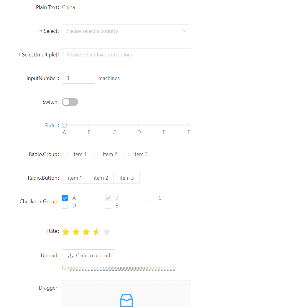
my_assign(this.form_data, data);
await this.$nextTick();
this.form.setFieldsValue(this.form_data);

From

1
2
3
4
5
6
7
8
9
10
11
12
13
14
15
16
17
18
19
20
21
22
23
24
25
26
27
28
29
30
31
32
33
34
35
36
37
38
39
40
41
42
43
44
45
46
47
48
49
50
51
52
53
54
55
56
57
58
59
60
61
62
63
64
65
66
67
68
69
70
71
72
73
74
75
76
77
78
79
80
81
82
83
84
85
86
87
88
89
90
91
92
93
94
95
96
97
98
99
100
101
102
103
104
105
106
107
108
109
110
111
112
113
114
115
116
117
118
119
120
121
122
123
124
125
126
127
128
129
130
131
132
133
134
135
136
137
138
139
140
141
142
143
144
145
146
147
148
149
150
151
152
153
154
155
156
157
158
159
160
161
162
163
164
165
166
167
168
169
170
171
172
173
174
175
176
177
178
179
180
181
182
183
184
185
186
187
188
189
190
191
192
193
194
195
196
197
198
199
200
201
202
203
204
205
206
207
208
209
210
211
212
213
214
215
216
217
218
219
220
221
222
223
224
225
226
227
<template>
<a-form
id="components-form-demo-validate-other"
:form="form"
v-bind="formItemLayout"
@submit="handleSubmit"
>
<a-form-item label="Plain Text">
<span class="ant-form-text">
China
</span>
</a-form-item>
<a-form-item label="Select" has-feedback>
<a-select
v-decorator="[
'select',
{ rules: [{ required: true, message: 'Please select your country!' }] },
]"
placeholder="Please select a country"
>
<a-select-option value="china">
China
</a-select-option>
<a-select-option value="usa">
U.S.A
</a-select-option>
</a-select>
</a-form-item>

<a-form-item label="Select[multiple]">
<a-select
v-decorator="[
'select-multiple',
{
rules: [
{ required: true, message: 'Please select your favourite colors!', type: 'array' },
],
},
]"
mode="multiple"
placeholder="Please select favourite colors"
>
<a-select-option value="red">
Red
</a-select-option>
<a-select-option value="green">
Green
</a-select-option>
<a-select-option value="blue">
Blue
</a-select-option>
</a-select>
</a-form-item>

<a-form-item label="InputNumber">
<a-input-number v-decorator="['input-number', { initialValue: 3 }]" :min="1" :max="10" />
<span class="ant-form-text">
machines
</span>
</a-form-item>

<a-form-item label="Switch">
<a-switch v-decorator="['switch', { valuePropName: 'checked' }]" />
</a-form-item>

<a-form-item label="Slider">
<a-slider
v-decorator="['slider']"
:marks="{ 0: 'A', 20: 'B', 40: 'C', 60: 'D', 80: 'E', 100: 'F' }"
/>
</a-form-item>

<a-form-item label="Radio.Group">
<a-radio-group v-decorator="['radio-group']">
<a-radio value="a">
item 1
</a-radio>
<a-radio value="b">
item 2
</a-radio>
<a-radio value="c">
item 3
</a-radio>
</a-radio-group>
</a-form-item>

<a-form-item label="Radio.Button">
<a-radio-group v-decorator="['radio-button']">
<a-radio-button value="a">
item 1
</a-radio-button>
<a-radio-button value="b">
item 2
</a-radio-button>
<a-radio-button value="c">
item 3
</a-radio-button>
</a-radio-group>
</a-form-item>

<a-form-item label="Checkbox.Group">
<a-checkbox-group
v-decorator="['checkbox-group', { initialValue: ['A', 'B'] }]"
style="width: 100%;"
>
<a-row>
<a-col :span="8">
<a-checkbox value="A">
A
</a-checkbox>
</a-col>
<a-col :span="8">
<a-checkbox disabled value="B">
B
</a-checkbox>
</a-col>
<a-col :span="8">
<a-checkbox value="C">
C
</a-checkbox>
</a-col>
<a-col :span="8">
<a-checkbox value="D">
D
</a-checkbox>
</a-col>
<a-col :span="8">
<a-checkbox value="E">
E
</a-checkbox>
</a-col>
</a-row>
</a-checkbox-group>
</a-form-item>

<a-form-item label="Rate">
<a-rate v-decorator="['rate', { initialValue: 3.5 }]" allow-half />
</a-form-item>

<a-form-item label="Upload" extra="longgggggggggggggggggggggggggggggggggg">
<a-upload
v-decorator="[
'upload',
{
valuePropName: 'fileList',
getValueFromEvent: normFile,
},
]"
name="logo"
action="/upload.do"
list-type="picture"
>
<a-button> <a-icon type="upload" /> Click to upload </a-button>
</a-upload>
</a-form-item>

<a-form-item label="Dragger">
<div class="dropbox">
<a-upload-dragger
v-decorator="[
'dragger',
{
valuePropName: 'fileList',
getValueFromEvent: normFile,
},
]"
name="files"
action="/upload.do"
>
<p class="ant-upload-drag-icon">
<a-icon type="inbox" />
</p>
<p class="ant-upload-text">
Click or drag file to this area to upload
</p>
<p class="ant-upload-hint">
Support for a single or bulk upload.
</p>
</a-upload-dragger>
</div>
</a-form-item>

<a-form-item :wrapper-col="{ span: 12, offset: 6 }">
<a-button type="primary" html-type="submit">
Submit
</a-button>
</a-form-item>
</a-form>
</template>

<script>
export default {
data: () => ({
form: this.$form.createForm(this, {name: 'coordinated'}),
formItemLayout: {
labelCol: { span: 6 },
wrapperCol: { span: 14 },
},
}),
beforeCreate() {
this.form = this.$form.createForm(this, { name: 'validate_other' });
},
methods: {
handleSubmit(e) {
e.preventDefault();
this.form.validateFields((err, values) => {
if (!err) {
console.log('Received values of form: ', values);
}
});
},
normFile(e) {
console.log('Upload event:', e);
if (Array.isArray(e)) {
return e;
}
return e && e.fileList;
},
},
};
</script>
<style>
#components-form-demo-validate-other .dropbox {
height: 180px;
line-height: 1.5;
}
</style>

展示效果

image-20211108173636067

注意

options 的配置项如下。

参数 说明 类型
props 仅仅支持 Form.create({})(CustomizedForm)的使用方式,父组件需要映射到表单项上的属性声明(和vue 组件 props 一致) {}
mapPropsToFields 把父组件的属性映射到表单项上(如:把 Redux store 中的值读出),需要对返回值中的表单域数据用 Form.createFormField 标记,如果使用$form.createForm 创建收集器,你可以将任何数据映射到 Field 中,不受父组件约束 (props) => ({ [fieldName]: FormField { value } })
name 设置表单域内字段 id 的前缀 -
validateMessages 默认校验信息,可用于把默认错误信息改为中文等,格式与 newMessages 返回值一致 Object { [nested.path]: String }
onFieldsChange Form.Item 子节点的值发生改变时触发,可以把对应的值转存到 Redux store Function(props, fields)
onValuesChange 任一表单域的值发生改变时的回调 (props, values) => void

FormModel

自定义footer

验证

1
2
3
4
5
6
7
8
9
10
11
12
13
14
15
16
17
18
19
20
21
22
23
24
25
26
27
28
29
30
31
32
33
34
35
36
37
38
39
40
41
42
43
44
45
46
47
48
49
50
51
52
53
54
55
56
57
58
59
60
61
62
63
64
65
66
67
68
69
70
71
72
73
74
75
76
77
78
79
80
81
<a-modal v-model="save_data_modal" width="50%" title="保存流程">
<a-form-model :model="save_form" ref="save_data_form" :rules="save_form_rules">
<a-form-model-item label="流程名称" required prop="chainName">
<a-input v-model="save_form.chainName" placeholder="请输入"/>
</a-form-model-item>
<a-form-model-item label="流程描述" required prop="chainDesc">
<a-input v-model="save_form.chainDesc" placeholder="请输入"/>
</a-form-model-item>

<a-form-model-item label="流程类型" required prop="chainType">
<a-input v-model="save_form.chainType" placeholder="请输入"/>
</a-form-model-item>

<a-form-model-item label="子流程信息">
<a-input placeholder="请输入"/>
</a-form-model-item>
</a-form-model>

<template slot="footer">
<div
:style="{
width: '100%',
background: '#fff',
display:'flex',
alignItem:'center',
justifyContent:'space-between',
}"
>
<a-button icon="close" :style="{ marginRight: '8px' }" @click="save_data_modal = false">
取消
</a-button>
<a-button icon="check" type="primary" @click="save_process_click">
保存
</a-button>
</div>
</template>
</a-modal>

<script>
import MyDrawUtil from "@/utils/zdrawutil";

import {apis_206040102, apis_206040114, apis_206040116} from "@/api/openplatform_processcreate";

export default {
name: "processCreate",
data() {
return {
save_data_modal: false,
save_form: {chainName: "", chainDesc: "", chainType: "", model: ""},
save_form_rules: {
chainName: [
{required: true, message: '请输入流程名称', trigger: 'blur'},
],
chainDesc: [
{required: true, message: '请输入流程描述', trigger: 'blur'},
],
chainType: [
{required: true, message: '请输入流程类型', trigger: 'blur'},
],
}
}
},

methods: {
save_process_click() {
this.$refs.save_data_form.validate(valid => {
console.info(valid);
if (valid) {
alert('submit!');
this.save_data_modal = false;
} else {
console.log('error submit!!');
return false;
}
});

},

}
}
</script>

只复制已有属性

1
2
3
4
5
6
7
8
export const my_assign = function (target, source) {
let keys = Object.keys(source);
for (const key of keys) {
if (target.hasOwnProperty(key)) {
target[key] = source[key];
}
}
}

循环生成的表单

1
2
3
4
5
6
7
8
9
10
11
12
13
14
15
16
17
18
19
20
21
22
23
24
25
26
27
28
29
30
31
32
33
34
35
36
37
38
39
40
41
42
43
44
45
46
47
48
49
<div class="right">
<div class="right_top">
<a-form-model
:ref="'edit_template_form_'+i"
:model="parameter"
:rules="edit_template_rules"
:label-col="{ span: 0 }"
:wrapper-col="{ span: 24 }"
v-for="(parameter,i) in parameterList" :key="i"
>
<a-row type="flex">
<a-col :span="4">
<div class="leftname">
<a-tooltip>
<template slot="title">
{{ parameter.path }}
</template>
{{ parameter.name }}
</a-tooltip>
</div>

</a-col>
<a-col :span="6">
<a-form-model-item prop="type">
<a-select v-model="parameter.type" placeholder="请选择">
<a-select-option :value="item.value" v-for="(item,index) in option" :key="index">
{{ item.name }}
</a-select-option>
</a-select>
</a-form-model-item>
</a-col>
<a-col :span="10">
<a-form-model-item prop="value">
<a-input v-model="parameter.value"/>
</a-form-model-item>
</a-col>
</a-row>
</a-form-model>

</div>
<div class="right_bottom">
<a-button type="primary" @click="edit_template_submit">
模板拼装
</a-button>
<a-button style="margin-left: 10px;" @click="edit_template_reset">
重置
</a-button>
</div>
</div>

数据和验证

1
2
3
4
5
6
7
8
9
10
11
12
13
14
15
16
17
18
19
20
21
22
23
24
25
26
27
28
29
30
31
32
33
34
35
36
37
38
39
40
41
42
43
44
45
46
47
48
49
50
51
52
53
54
55
export default {
name: "Index",
data() {
return {
"option": [
{name: "常量", value: "0"},
{name: "payId", value: "payId"},
{name: "orderNum", value: "orderNum"},
{name: "respCode", value: "respCode"},
],
parameterList: [
{
"name": "string",
"path": "string",
"type": "0",
"value": "string"
},
{
"name": "string",
"path": "string",
"type": "0",
"value": "string"
}
],
edit_template_rules: {
type: [{required: true, message: '请选择属性类型', trigger: 'change'}],
value: [{required: true, message: '请输入属性的值', trigger: 'blur'}],
},
}
},
methods: {
async edit_template_submit() {
let parameterList = this.parameterList;
let result = true;
for (let i = 0; i < parameterList.length; i++) {
try {
await this.$refs["edit_template_form_" + i][0].validate();
result = result && true;
} catch (e) {
result = result && false;
}
}
console.info("表单验证结果:" + result)
if (result) {
console.info(this.parameterList);
}
},
edit_template_reset() {
let parameterList = this.parameterList;
for (let i = 0; i < parameterList.length; i++) {
this.$refs["edit_template_form_" + i][0].resetFields();
}
}
}
}

注意几点

  1. 循环生成的表单,不可能用一个组件就能实现,我们要循环生成多个组件做验证。
  2. 获取到的引用为数组,要这样取this.$refs["edit_template_form_" + i][0]
  3. 通过await this.$refs["edit_template_form_" + i][0].validate()来验证的时候,返回的不是true/false,如果验证不通过的时候,会抛出异常,其中异常efalse,所以直接try/catch即可。

自定义验证

1
2
3
4
5
6
7
8
9
10
11
12
13
edit_template_rules: {
type: [{required: true, message: '请选择属性类型', trigger: 'change'}],
value: [{
validator: function (rule, value, callback) {
console.info("validator:", value);
if (value.length <= 10) {
callback();
} else {
callback("长度不能大于10!");
}
}, trigger: 'blur'
}],
}

这里属性type用的依旧是系统的验证,value使用的是自定义验证。

其中

  • rule: 是我们传入的校验规则自身的属性。
  • value: 是被校验组件的值。
  • callback: 校验通过要调用callback();,校验不通过callback方法内传入字符串就行。

目前还不知道怎么让组件更根据另一个组件的值来校验。

Tree

单独使用

1
2
3
4
5
6
7
<a-tree
checkable
:auto-expand-parent="true"
v-model="menu_selected_keys"
:tree-data="menu_data"
:replaceFields="menu_replace_fields"
/>

JS

1
2
3
4
5
6
7
8
9
export default {
data: function () {
return {
menu_data: [],
menu_replace_fields: {children: 'children', title: 'name', key: 'id'},
menu_selected_keys:[1,2]
}
}
}

注意

replaceFields的key是组件需要的属性,对应的value是我们menu_data中的对应的属性。

和Form结合

1
2
3
4
5
6
7
8
9
10
11
12
13
<a-form-item label="分配权限">
<a-input
v-show="false"
v-decorator="['sysRouteId', { rules: [{ required: true, message: '尚未分配权限!' }] }]"
/>
<a-tree
checkable
:auto-expand-parent="true"
v-model="menu_selected_keys"
:tree-data="menu_data"
:replaceFields="menu_replace_fields"
/>
</a-form-item>

JS

1
2
3
4
5
6
7
8
9
10
11
12
13
14
15
16
17
18
19
20
export default {
data: function () {
return {
form_data: {
name: "", code: "", remark: "", sysRouteId: ""
},
form: this.$form.createForm(this, {name: 'coordinated'}),
menu_data: [],
menu_replace_fields: {children: 'children', title: 'name', key: 'id'},
menu_selected_keys: []
}
},
watch: {
menu_selected_keys: function () {
this.form.setFieldsValue({
"sysRouteId": this.menu_selected_keys.join(",")
});
}
},
}

这样修改时也只用给menu_selected_keys赋值即可。

注意类型一致,用split分割的时字符串数组,这里使用map进行转换。

1
2
3
if (this.form_data.sysRouteId) {
this.menu_selected_keys = this.form_data.sysRouteId.split(",").map(item => parseInt(item));
}

级联

1
2
3
4
5
6
7
8
9
10
11
12
13
14
15
16
17
18
19
20
21
22
23
24
25
26
27
28
29
30
31
32
33
34
35
36
37
38
39
40
41
42
43
44
45
46
47
48
49
50
51
52
53
54
55
56
<template>
<a-cascader
:field-names="{ label: 'name', value: 'code', children: 'items' }"
:options="options"
placeholder="请选择"
@change="onChange"
/>
</template>
<script>
const options = [
{
code: 'zhejiang',
name: 'Zhejiang',
items: [
{
code: 'hangzhou',
name: 'Hangzhou',
items: [
{
code: 'xihu',
name: 'West Lake',
},
],
},
],
},
{
code: 'jiangsu',
name: 'Jiangsu',
items: [
{
code: 'nanjing',
name: 'Nanjing',
items: [
{
code: 'zhonghuamen',
name: 'Zhong Hua Men',
},
],
},
],
},
];
export default {
data() {
return {
options,
};
},
methods: {
onChange(value) {
console.log(value);
},
},
};
</script>

弹窗 a-modal

1
2
3
4
5
6
7
8
9
10
11
<a-modal
ref="edit"
:title="editTitle"
:getContainer="() => $el"
:visible="editVisible"
@ok="editOk"
@cancel="editCancel"
:footer="showOrEdit===0 ? null : undefined"
width="40%"
>
</a-modal>

注意:footer的值为

  • null 不显示底部按钮
  • undefined 显示默认底部按钮

自定义底部按钮

1
2
3
4
5
6
7
8
9
10
11
12
13
14
<a-modal
:title="modaltitle"
:visible="visible"
:confirm-loading="confirmLoading"
:footer="!isDetail ? null : undefined"
@cancel="handleCancel"
>
<template slot="footer">
<div>
<a-button type="white" @click="handleCancel">取消</a-button>
<a-button type="primary" @click="handleOk">确定</a-button>
</div>
</template>
</a-modal>

抽屉

底部带按钮

1
2
3
4
5
6
7
8
9
10
11
12
13
14
15
16
17
18
19
20
21
22
23
24
25
26
27
28
29
30
31
32
33
<a-drawer
title="标题"
placement="right"
:closable="false"
:body-style="{ paddingBottom: '60px' }"
:visible="showAdd"
>
<div>
111111
</div>

<div
:style="{
position: 'absolute',
right: 0,
bottom: 0,
width: '100%',
display:'flex',
alignItems:'center',
justifyContent:'space-between',
borderTop: '1px solid #e9e9e9',
padding: '10px 16px',
background: '#fff',
textAlign: 'right',
zIndex: 1,
}"
>
<a-button :style="{ marginRight: '8px' }">
取消
</a-button>
<a-button html-type="submit" type="primary"> 确定</a-button>
</div>
</a-drawer>

日期选择

选择日期和时间

1
<a-date-picker show-time v-model="save_form.cronTime" placeholder="请选择时间"/>

选择日期

1
<a-date-picker v-model="save_form.parameter" placeholder="请选择日期" @change="onDateChange" @ok="onDateOk"/>

注意绑定的是moment对象,赋值取值的时候要做转换

1
2
3
4
5
6
7
8
import moment from "moment";
// 赋值
this.save_form.cronTime = moment(res.data.cronTime);
this.save_form.parameter = moment(res.data.parameter);

//取值
let cronTime = this.save_form.cronTime.format("YYYY-MM-DD HH:mm:ss")
let parameter = this.save_form.parameter.format("YYYY-MM-DD")

日期禁用

1
<a-date-picker show-time v-model="save_form.cronTime" placeholder="请选择时间" :disabled-date="disabledDate"/>

JS

1
2
3
disabledDate(current) {
return current && current < moment().endOf('day');
},

分页

https://1x.antdv.com/components/pagination-cn/

模板

1
2
3
4
5
6
<a-pagination
show-quick-jumper
:default-current="currPage"
:pageSize="pageSize"
:total="totalCount"
@change="onPageChange"/>

属性

1
2
3
currPage: 1,
pageSize: 10,
totalCount: 0,

方法

1
2
3
4
onPageChange(pageNumber) {
this.currPage = pageNumber;
this.getTaskList()
},

折叠面板

1
2
3
4
5
6
7
8
9
10
11
12
13
14
15
16
17
18
19
<a-collapse :bordered="false" style="background: #ffffff;">
<template #expandIcon="props">
<a-icon type="caret-right" :rotate="props.isActive ? 90 : 0" style="color: #4478ff;font-size: 14px"/>
</template>
<a-collapse-panel
style="background: #ffffff;border-radius: 4px;margin-bottom: 0;border: 0;overflow: hidden"
v-for="(item0,i0) in tableData"
v-if="tableData.length>0" :key="i0">
<div slot="header">
<div class="myheader">这是标题
<div class="line"></div>
</div>
</div>

<div>
这是内容
</div>
</a-collapse-panel>
</a-collapse>

插件推荐

色块选择插件

https://madewith.cn/564